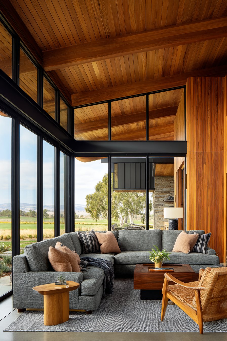
The world of interior design is experiencing a dramatic shift away from the traditional neutral palette that has dominated our homes for decades. While beige and grey have long been the safe choices for homeowners seeking timeless elegance, a new generation of unexpected colors is emerging as the sophisticated alternative. These fresh neutrals bring warmth and character without sacrificing versatility, offering homeowners the perfect balance between bold expression and lasting appeal.
Understanding the evolution of neutral colors reveals much about our changing relationship with our living spaces. The pandemic transformed how we view our homes, shifting them from mere shelters to multi-functional sanctuaries where we work, relax, and create. This transformation demands colors that energize rather than fade into the background, hues that spark joy while maintaining the flexibility we’ve come to expect from traditional neutrals. The new neutrals respond to this need by offering depth and personality that beige and grey simply cannot match.
These emerging colors represent a sophisticated understanding of how color impacts our daily lives. They work seamlessly with various design styles, from contemporary minimalism to organic modernism, while providing the visual interest that makes a house feel like home. Whether you’re planning a complete renovation or simply refreshing a single room, these new neutrals offer endless possibilities for creating spaces that feel both current and timeless.
1. Warm Terracotta and Clay Tones
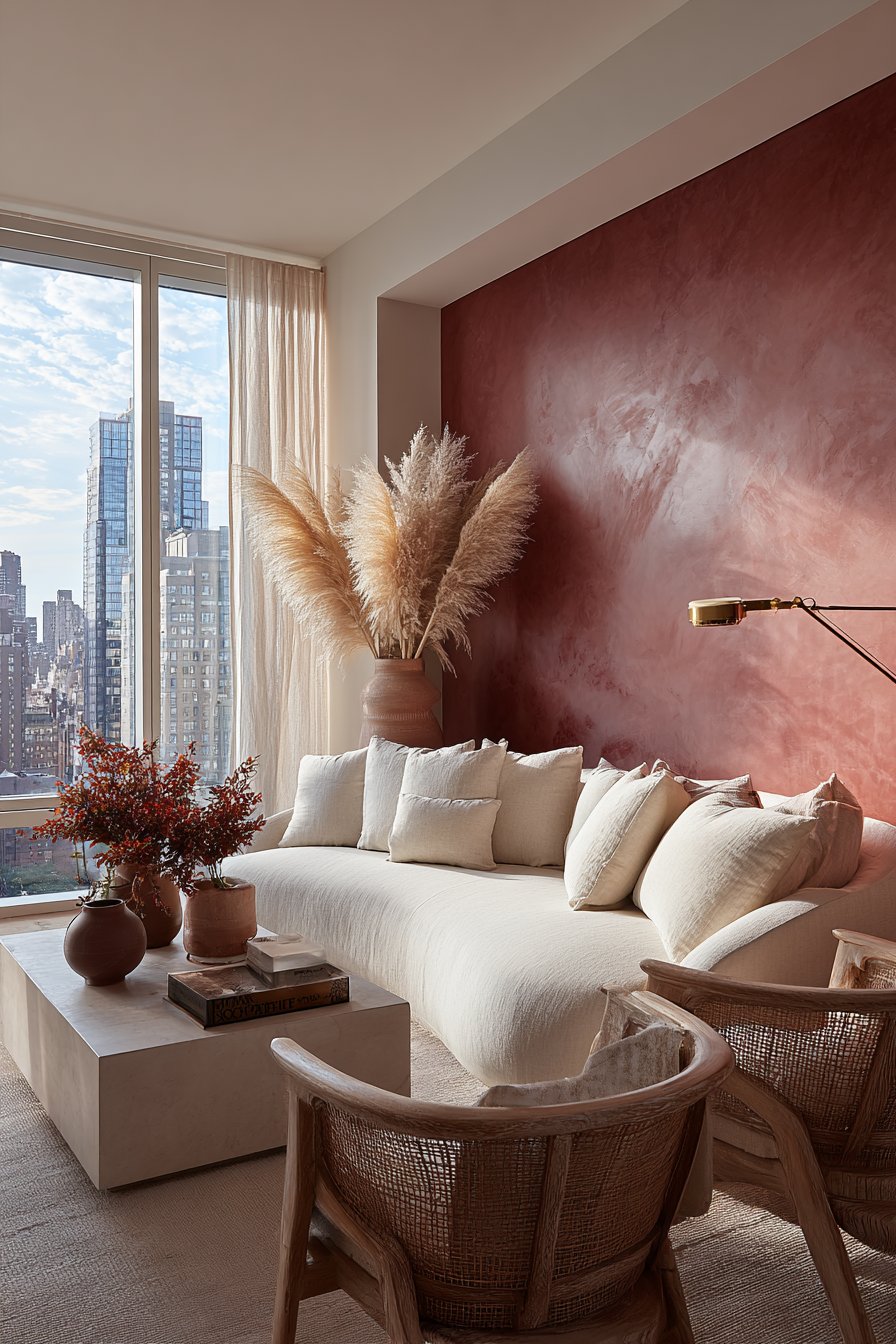
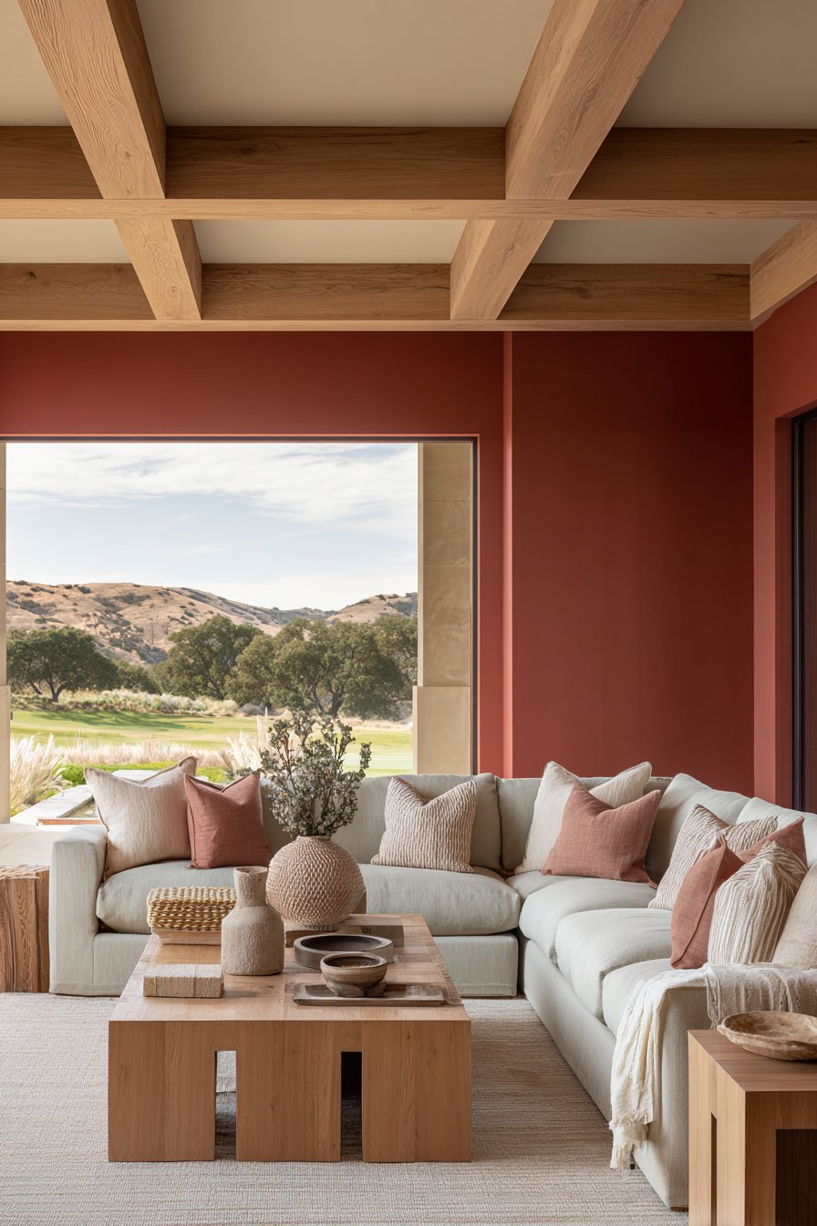
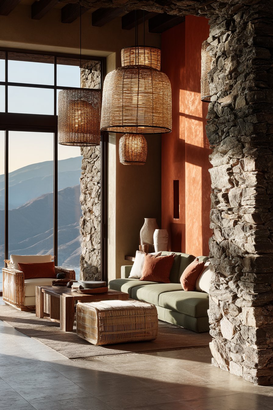
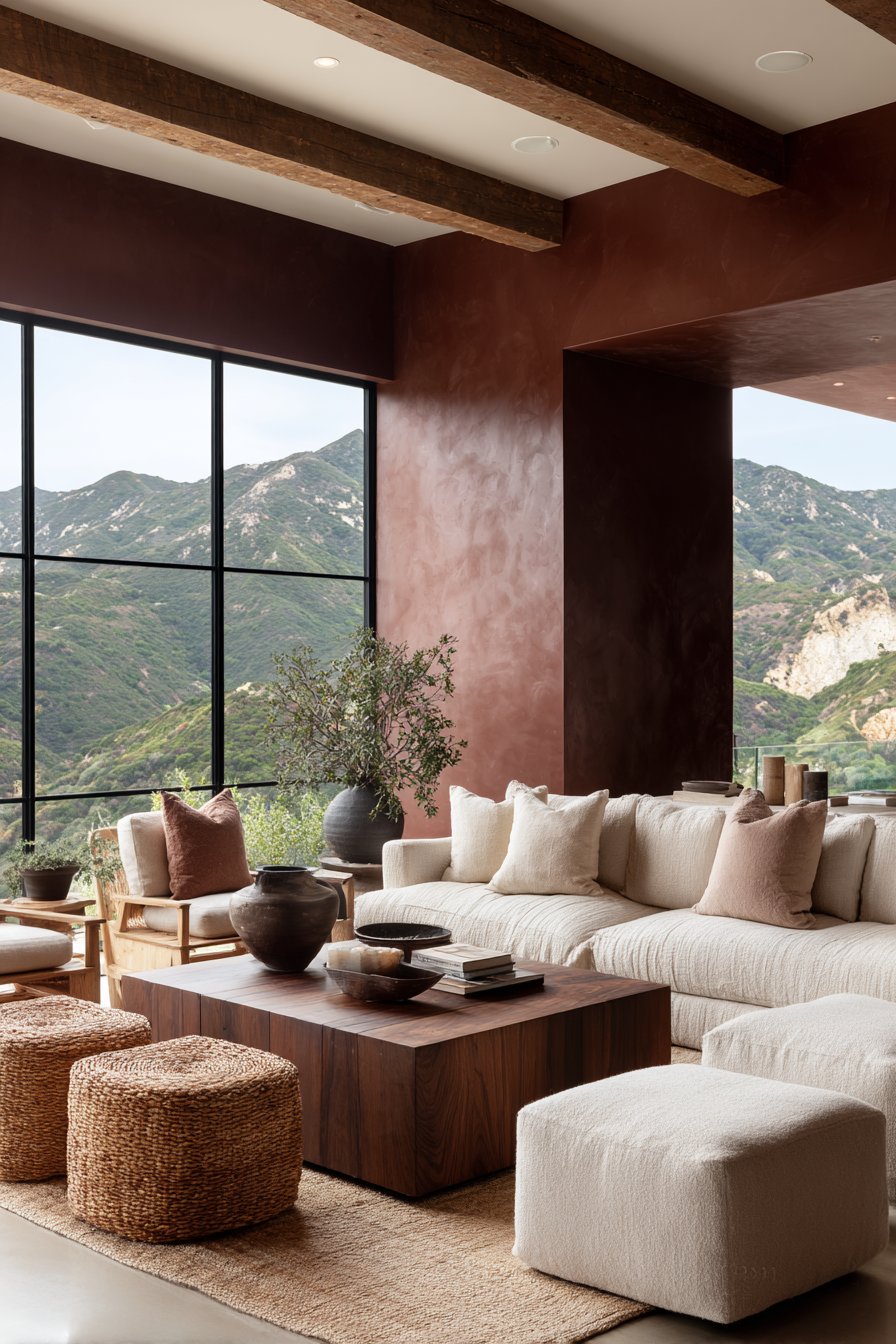
Terracotta and clay tones are leading the charge as the most sought-after neutral alternatives in contemporary interior design. These earthy hues bring an organic warmth that connects indoor spaces with nature, creating environments that feel grounded and welcoming. Unlike the coolness of grey, terracotta introduces a sunset-inspired glow that flatters skin tones and creates inviting atmospheres in any room.
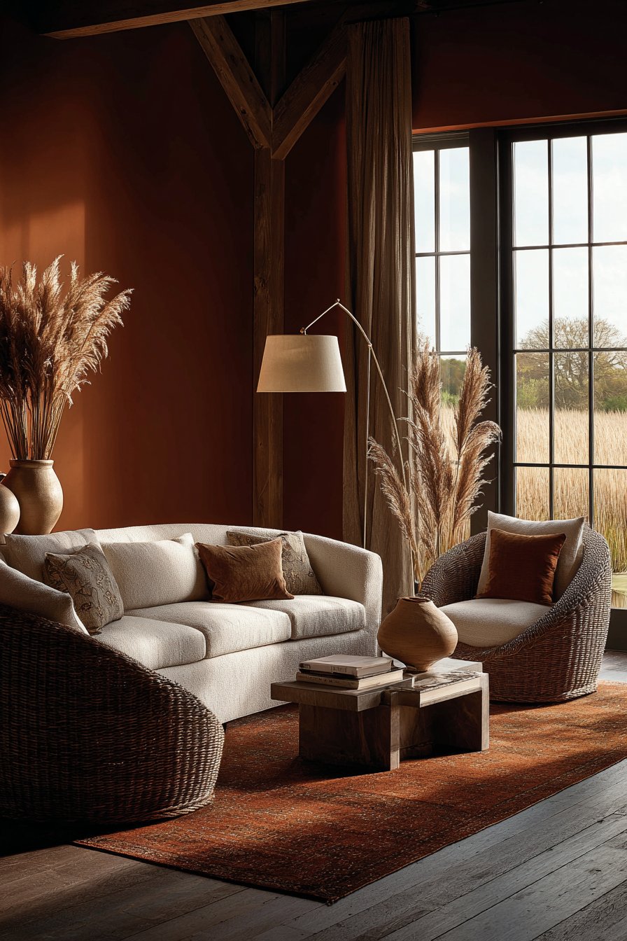
The beauty of terracotta lies in its incredible versatility across different lighting conditions. In north-facing rooms with limited natural light, these warm tones combat the cold blue cast that often plagues grey walls. Southern exposures allow terracotta to showcase its full vibrancy, while artificial lighting in the evening brings out rich, cozy undertones. This adaptability makes it an excellent choice for open-concept living where consistent color flow matters.
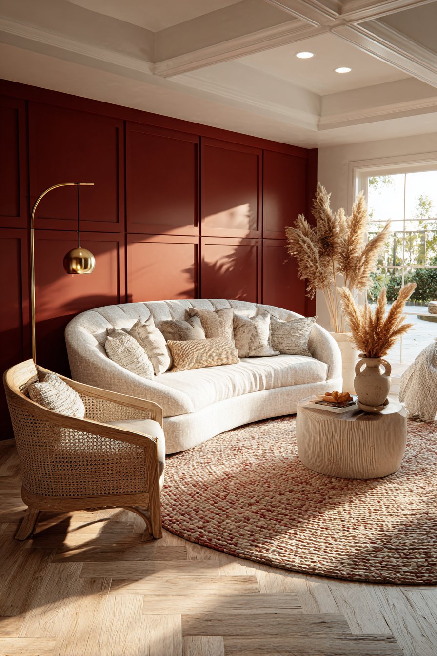
Design professionals are embracing terracotta for its ability to pair beautifully with both warm and cool accent colors. It provides the perfect backdrop for jewel tones like emerald and sapphire while also complementing softer pastels. The color works exceptionally well with natural materials like wood, rattan, and linen, reinforcing the current trend toward sustainable, biophilic design.
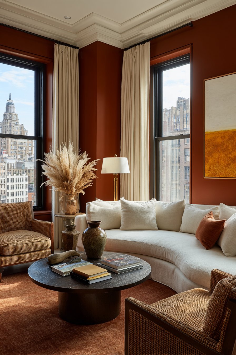
- Apply terracotta on accent walls rather than entire rooms for a balanced approach
- Pair with crisp white trim to create definition and contemporary contrast
- Layer different shades from pale clay to deep rust for dimensional interest
- Incorporate terracotta through textiles like throw pillows and area rugs first
- Use matte finishes to emphasize the earthy, natural quality of the color
- Combine with brass or copper fixtures for a cohesive warm metal palette
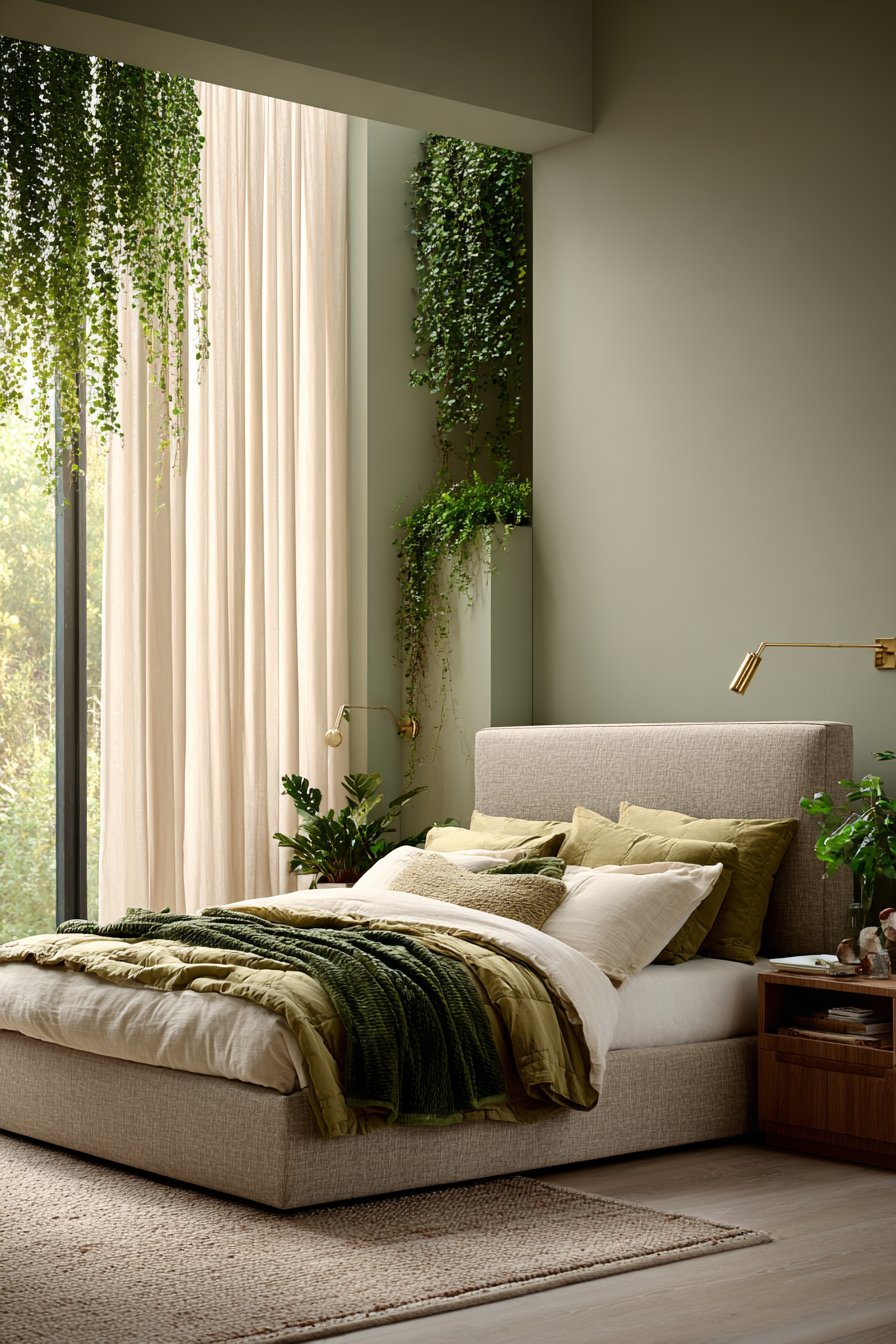
2. Sage Green and Olive Undertones
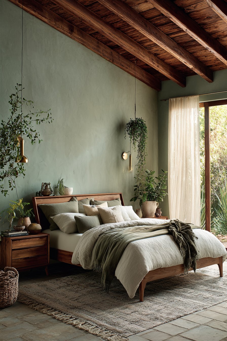
Sage green has emerged as a calming alternative to sterile grey, bringing the restorative qualities of nature indoors. This sophisticated green-grey hybrid offers the neutrality homeowners crave while introducing a subtle color element that feels fresh and contemporary. Olive undertones particularly shine in spaces where you want to promote relaxation and well-being.
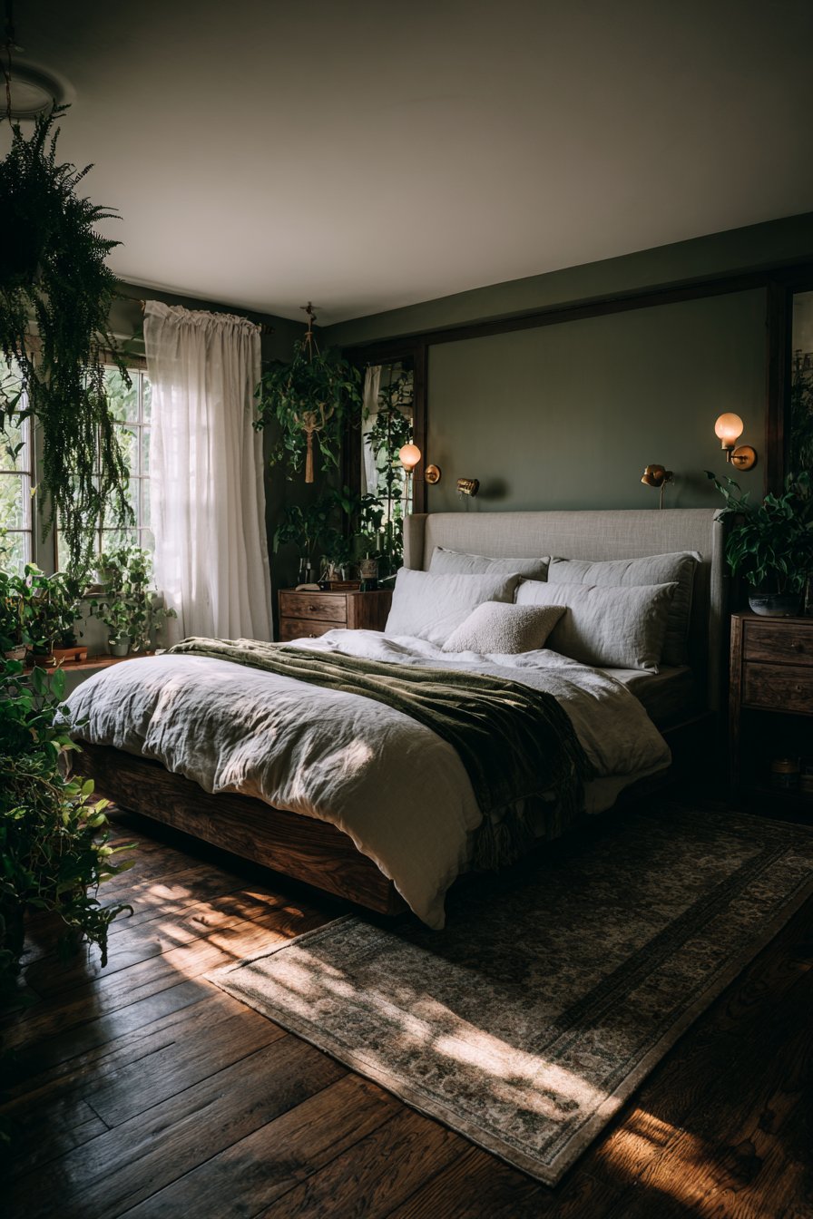
The psychological benefits of green hues make sage an ideal choice for bedrooms, home offices, and living areas. Studies show that green tones reduce eye strain and promote concentration, making them perfect for spaces where we work or study. Unlike bright greens that can feel overwhelming, sage provides a muted sophistication that works beautifully in both traditional and modern settings.
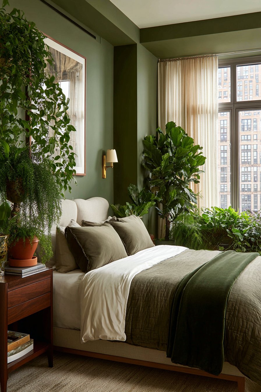
Sage green demonstrates remarkable compatibility with a wide range of design elements and color schemes. It serves as an excellent neutral foundation that supports both warm wood tones and cool metal finishes. The color pairs exceptionally well with natural textiles, creating layered spaces that feel collected rather than decorated. Its chameleon-like quality allows it to read more grey in some lights and more green in others.
- Choose sage with grey undertones for a more neutral appearance in conservative spaces
- Pair with warm whites rather than stark whites to avoid a clinical feel
- Add depth by incorporating darker olive accents in furniture or window treatments
- Use in kitchens and bathrooms where the color’s freshness feels particularly appropriate
- Complement with natural wood elements in medium to dark tones for richness
- Layer various green tones from pale mint to deep forest for a monochromatic scheme
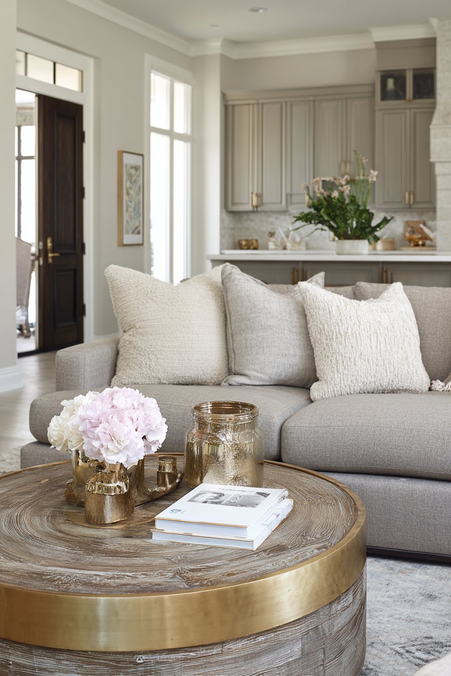
3. Warm Taupe and Greige Blends
Warm taupe represents the evolution of traditional beige, offering the familiarity of neutral tones with significantly more character and depth. This sophisticated blend of grey and beige, often called greige, provides the best of both worlds without the cold austerity of pure grey or the dated feel of yellow-toned beige. Modern taupes lean toward warm undertones that create inviting, enveloping spaces.
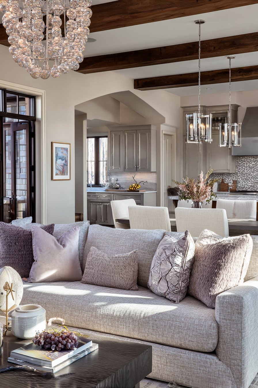
The secret to successful taupe lies in selecting shades with the right undertone balance for your specific lighting conditions. Rooms with abundant natural light can support taupes with stronger grey components, while spaces with limited daylight benefit from warmer, more brown-leaning versions. The key is testing samples on your walls and observing them throughout the day.
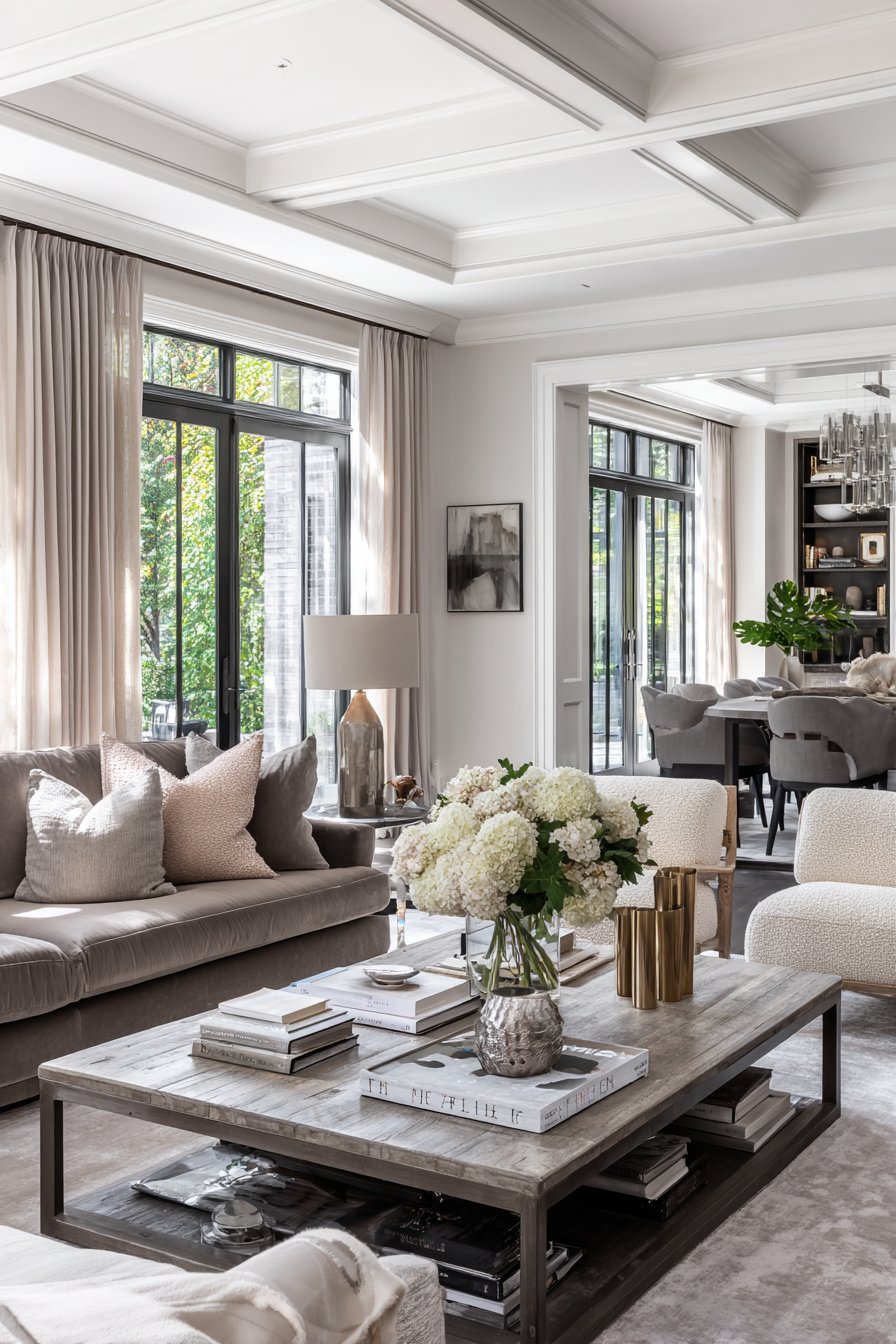
Warm taupe excels as a whole-home neutral that creates seamless flow between rooms while allowing each space to maintain its own character through accessories and furnishings. It provides enough color to feel intentional while remaining neutral enough to support bold accent choices. This flexibility makes it particularly valuable in open floor plans where color continuity matters.
- Test paint samples in various lighting conditions before committing to a shade
- Look for taupes with pink or violet undertones for a modern sophisticated feel
- Avoid taupes with strong yellow undertones that read as outdated beige
- Use darker taupe tones on trim and doors for an elegant monochromatic look
- Pair with both silver and gold metallics as taupe bridges warm and cool tones
- Layer textures extensively since subtle color requires textural interest for depth
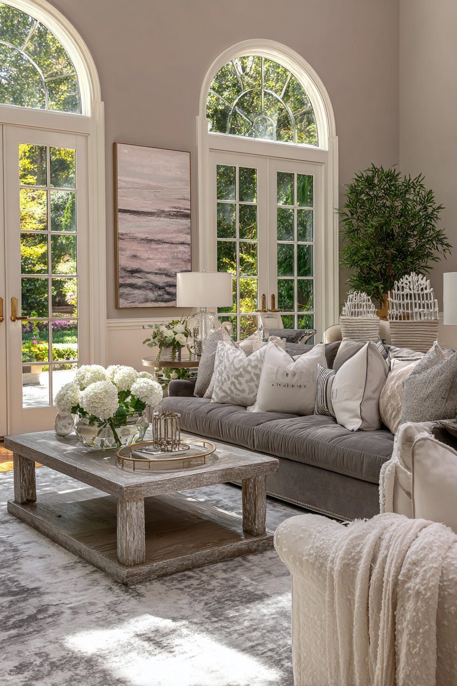
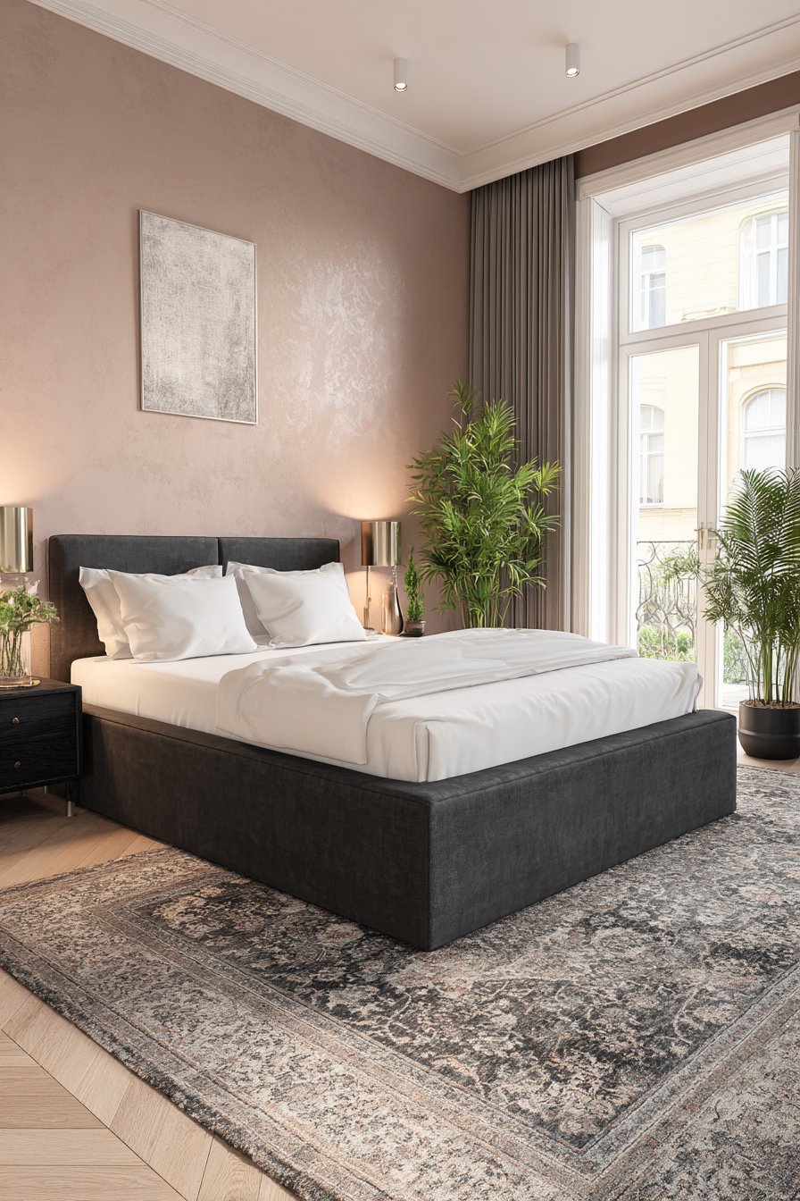
4. Soft Blush and Dusty Rose
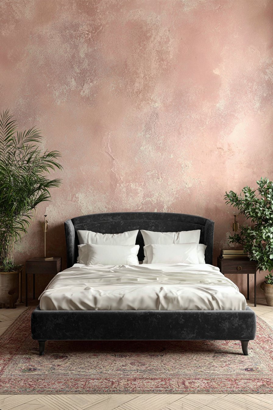
Blush and dusty rose are redefining neutral sophistication by introducing gentle pink undertones that add warmth without reading as overtly feminine. These subtle hues create spaces that feel nurturing and serene while maintaining the versatility expected from neutral colors. The key lies in selecting muted, dusty versions rather than bright pinks that limit design flexibility.
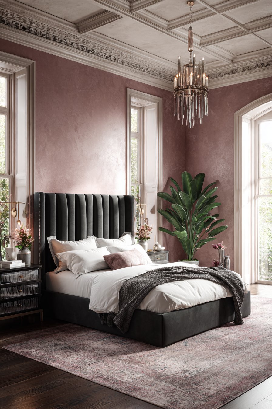
Contemporary blush tones work particularly well in spaces where you want to create a cocooning effect without the heaviness of darker colors. They reflect light beautifully, making rooms feel larger and more open while adding a whisper of color that prevents spaces from feeling sterile. Modern formulations avoid the peachy tones of the 1980s, instead offering cleaner, more sophisticated pink-greys.
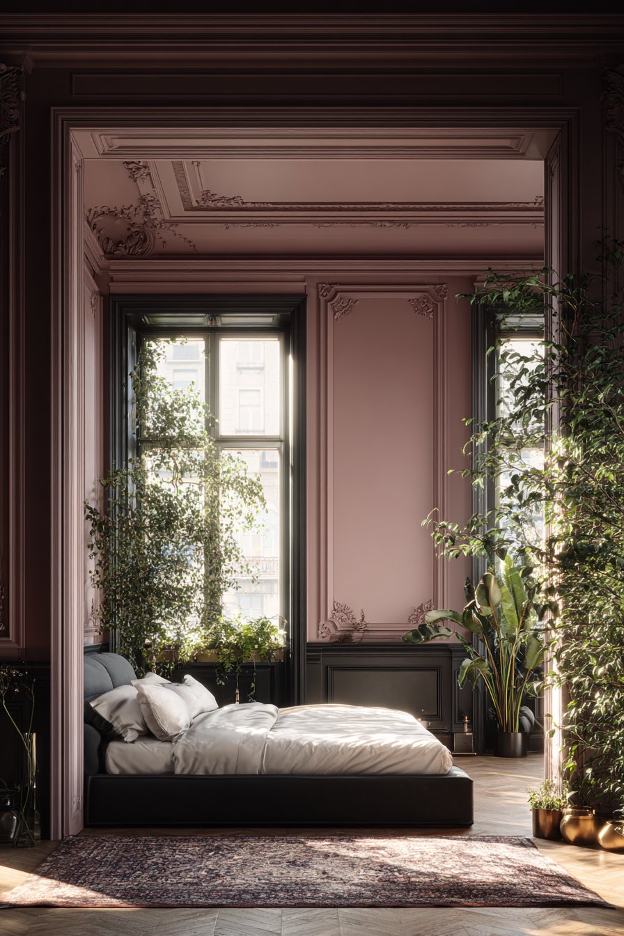
The surprising versatility of blush allows it to work with unexpected color combinations and design styles. It pairs beautifully with charcoal and navy for sophisticated contrast, works harmoniously with greens for a botanical feel, and complements metallic finishes from brushed nickel to antique brass. This adaptability makes blush an excellent choice for those wanting something different from standard neutrals.
- Choose blush tones with grey or mauve undertones for maximum versatility
- Use in spaces with good natural light to prevent the color from appearing too intense
- Pair with crisp white bedding and trim in bedrooms for a hotel-inspired look
- Incorporate through larger furniture pieces like sofas for commitment-free testing
- Balance with cooler tones in accessories to prevent spaces from feeling too warm
- Consider blush in unexpected spaces like home offices or bathrooms for gentle energy
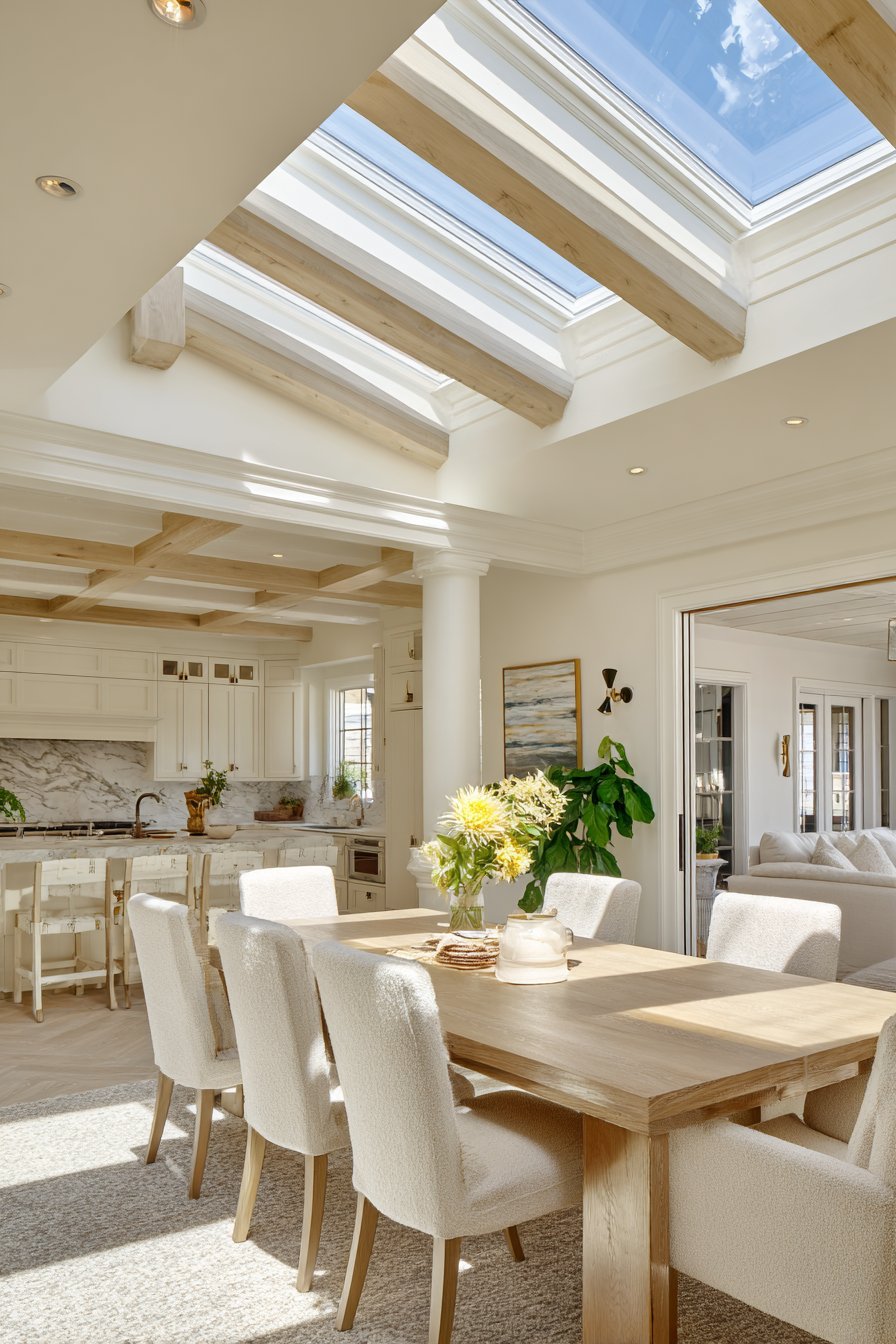
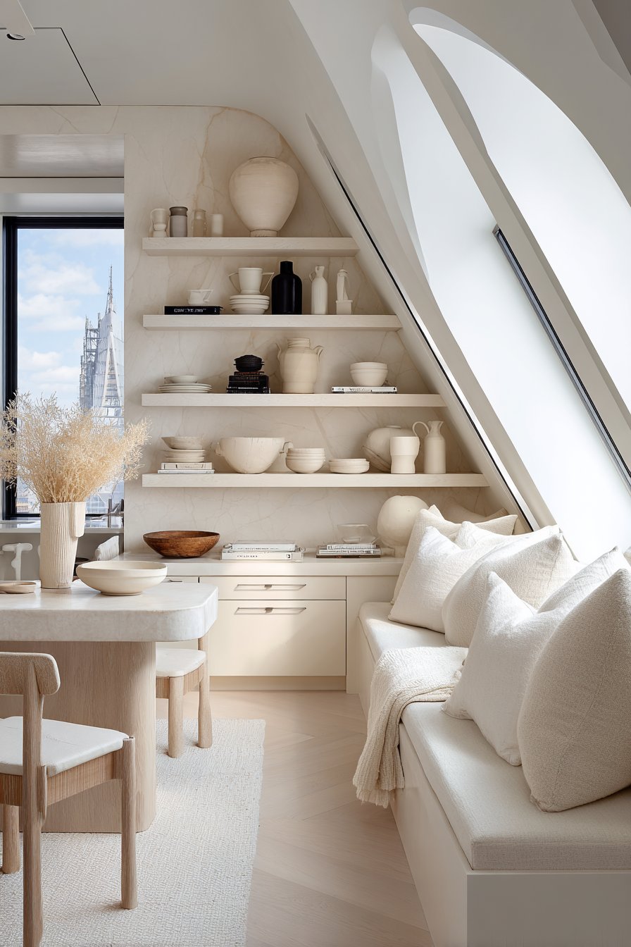
5. Warm Cream and Ivory Foundations
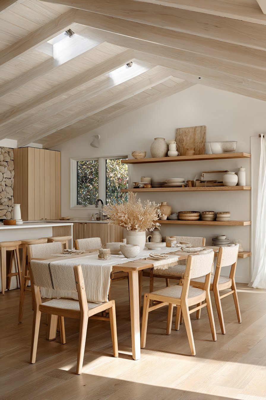
Warm cream and ivory are experiencing a renaissance as homeowners seek alternatives to stark white that still provide brightness and spaciousness. These colors offer the light-reflecting qualities we value in white while introducing warmth that makes spaces feel more inviting and less sterile. Modern creams avoid the yellow tones that can appear dingy, instead offering clean warmth.
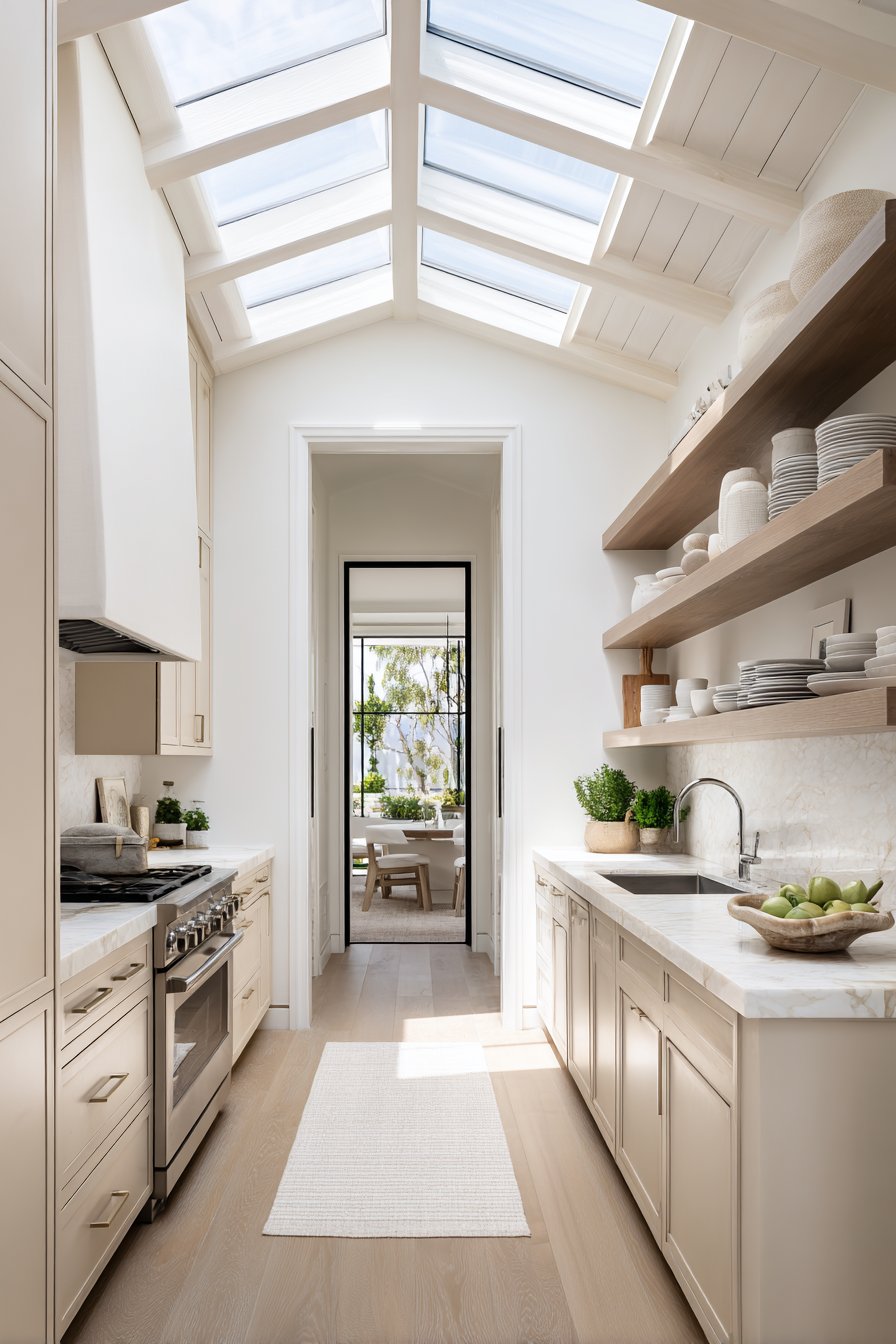
The beauty of cream lies in its ability to serve as both a neutral background and a color statement depending on the context. In rooms with bold artwork or colorful furnishings, cream recedes to let other elements shine. In minimalist spaces, the subtle warmth of cream provides character and depth that pure white cannot achieve. This dual nature makes it exceptionally practical.
Cream demonstrates particular strength in creating cohesive color schemes throughout a home. It works as a unifying element that connects various spaces while allowing individual rooms to express unique personalities through accent colors. The warmth of cream also flatters skin tones better than cool whites, making it ideal for spaces where people gather and interact.
- Select creams with neutral undertones rather than yellow or pink leanings
- Use slightly warmer creams on walls and cooler whites on trim for subtle contrast
- Layer various shades of cream and ivory for a sophisticated monochromatic palette
- Pair with natural materials and textures to prevent spaces from appearing flat
- Choose cream for ceilings to add warmth while maintaining the expansive feel
- Consider cream in kitchens as a softer alternative to bright white cabinetry
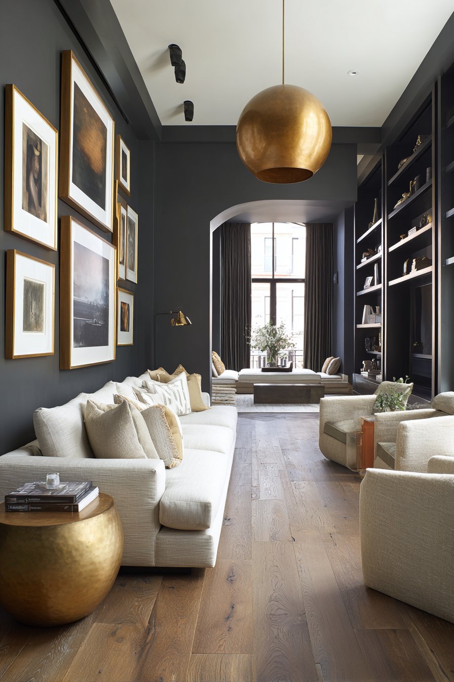
6. Charcoal and Deep Slate
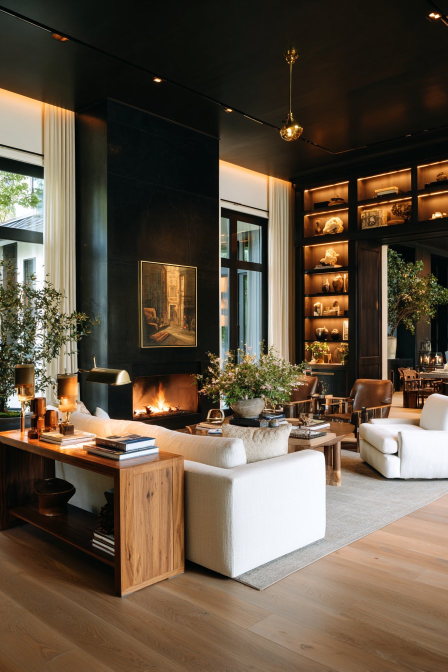
Charcoal and deep slate represent the sophisticated end of the neutral spectrum, offering dramatic alternatives to light grey that create cozy, intimate atmospheres. These deeper tones work particularly well in specific applications where traditional pale neutrals feel too casual or cold. The richness of charcoal provides architectural drama that elevates any space from ordinary to extraordinary.
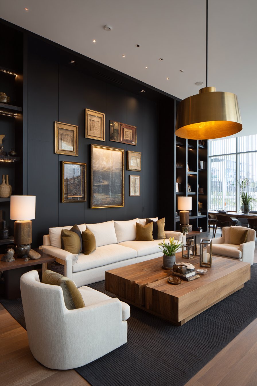
Deep neutral tones excel in creating accent walls that add depth without the commitment of bright colors. They provide striking contrast against lighter furnishings while serving as dramatic backdrops for artwork and decorative objects. In smaller spaces like powder rooms or reading nooks, charcoal creates an enveloping cocoon effect that feels luxurious rather than confining.
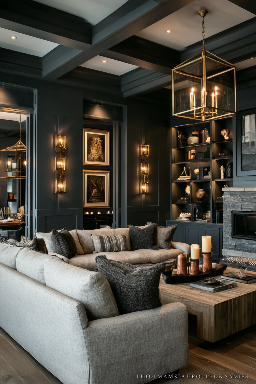
The versatility of dark neutrals extends beyond walls to cabinetry, built-ins, and architectural elements. Charcoal kitchen cabinets offer a sophisticated alternative to white or wood, while slate-toned built-in shelving adds visual weight and importance to a room. These applications provide the grounding effect that spaces need without the starkness of black or the coldness of light grey.
- Use charcoal on accent walls behind beds or sofas for architectural impact
- Balance dark walls with plenty of light-colored furnishings and textiles
- Ensure adequate lighting in rooms with dark walls to prevent a cave-like feel
- Pair with warm metallics like brass or copper to add warmth to cool charcoal
- Consider charcoal for exterior doors to create striking curb appeal
- Test samples carefully as charcoal can appear very different under various lighting
Conclusion
The movement away from beige and grey represents a broader shift toward more personalized, emotionally resonant interiors. These new neutrals demonstrate that we can maintain versatility and timelessness while embracing colors that bring joy and character to our homes. Whether you choose the earthiness of terracotta, the serenity of sage, or the sophistication of warm taupe, these colors offer fresh possibilities for creating spaces that truly reflect who you are.
Embracing these new neutrals doesn’t require a complete home overhaul. Start with a single accent wall, introduce the color through textiles, or commit fully to a room transformation. The beauty of these hues lies in their flexibility and forgiving nature. Trust your instincts, test samples in your actual space, and remember that the best neutral is always the one that makes you feel at home and inspired every time you walk through the door.