Color is more than just a visual element in your home. It’s a powerful tool that influences mood, behavior, and even physical well-being. Understanding color psychology transforms ordinary spaces into environments that support your lifestyle and emotional needs. Whether you’re refreshing a single room or planning a complete renovation, the colors you choose create lasting impressions on everyone who enters your space.
The science behind color psychology has been studied for decades, revealing fascinating connections between hues and human emotions. Professional designers leverage this knowledge to craft spaces that feel intentionally calming, energizing, or inspiring. Every shade carries psychological weight, affecting everything from productivity levels to sleep quality. This makes color selection one of the most critical decisions in home design.
This comprehensive guide explores how different colors impact our psychological state and provides actionable strategies for implementing these principles in your home. You’ll discover which hues promote relaxation, which encourage creativity, and how to balance color temperature for optimal comfort. These insights will empower you to create spaces that truly enhance your daily life.
1. Understanding Warm Colors and Energy
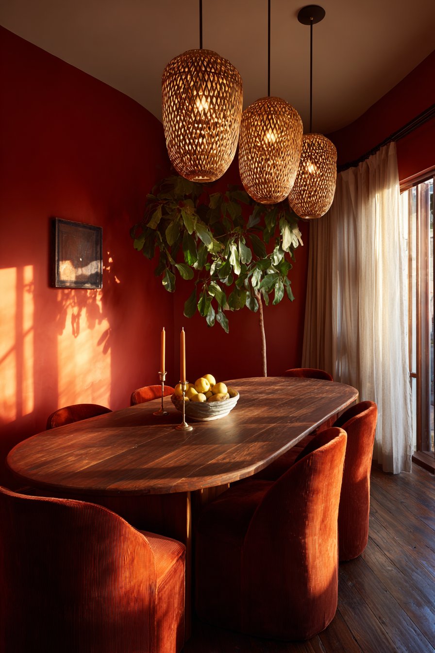
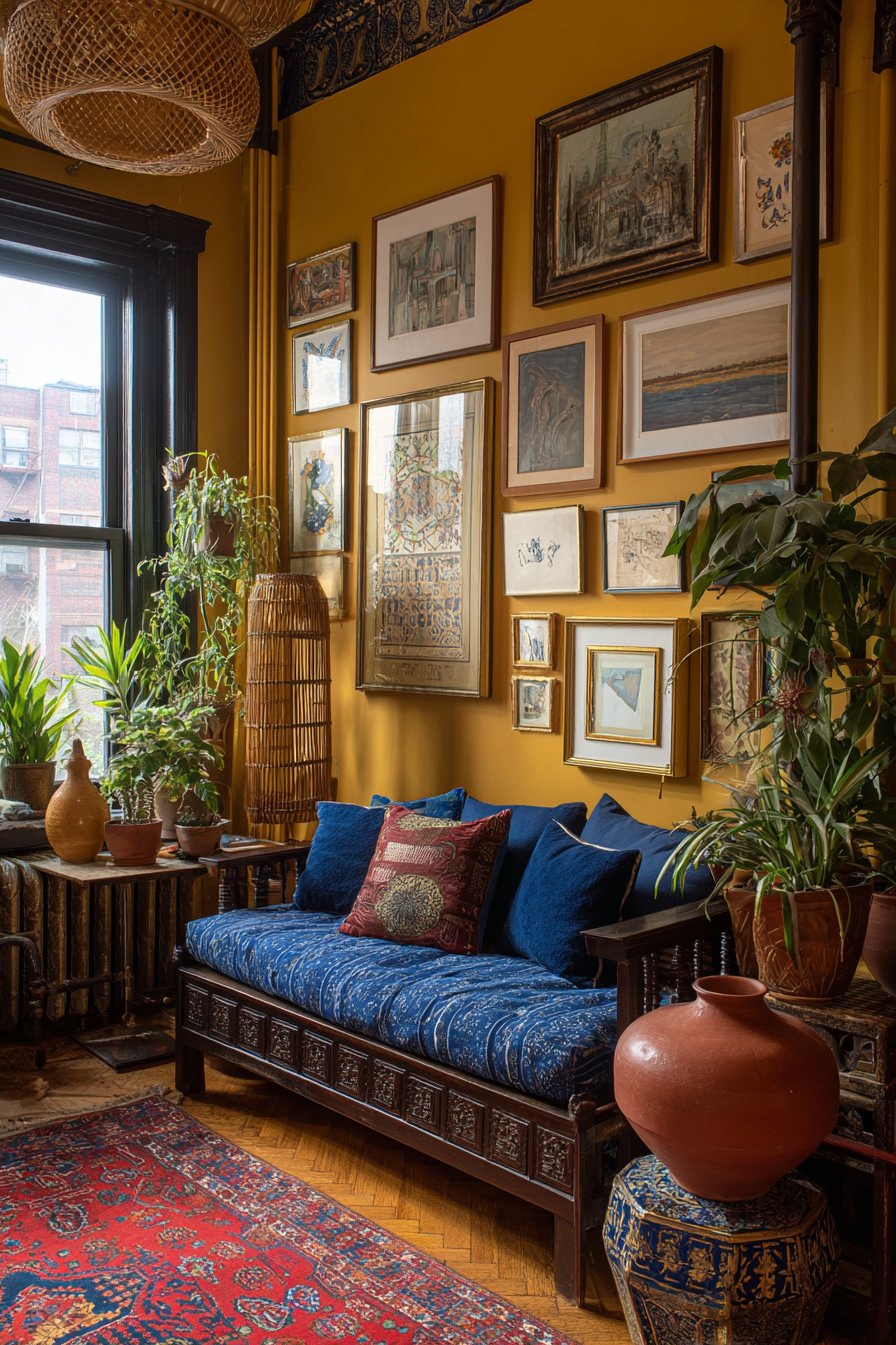
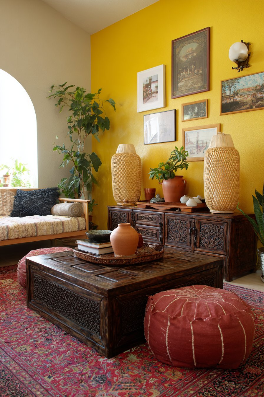
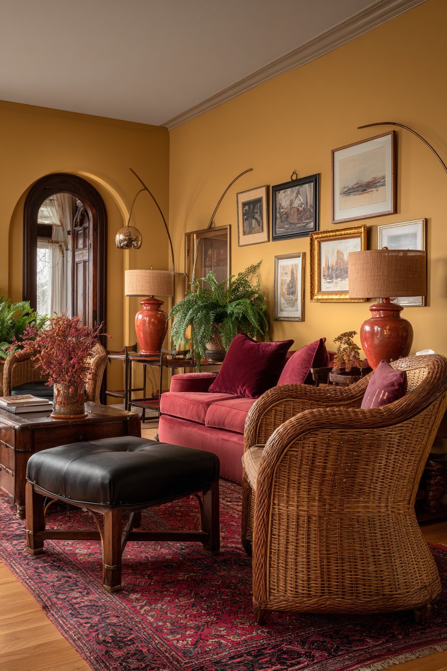
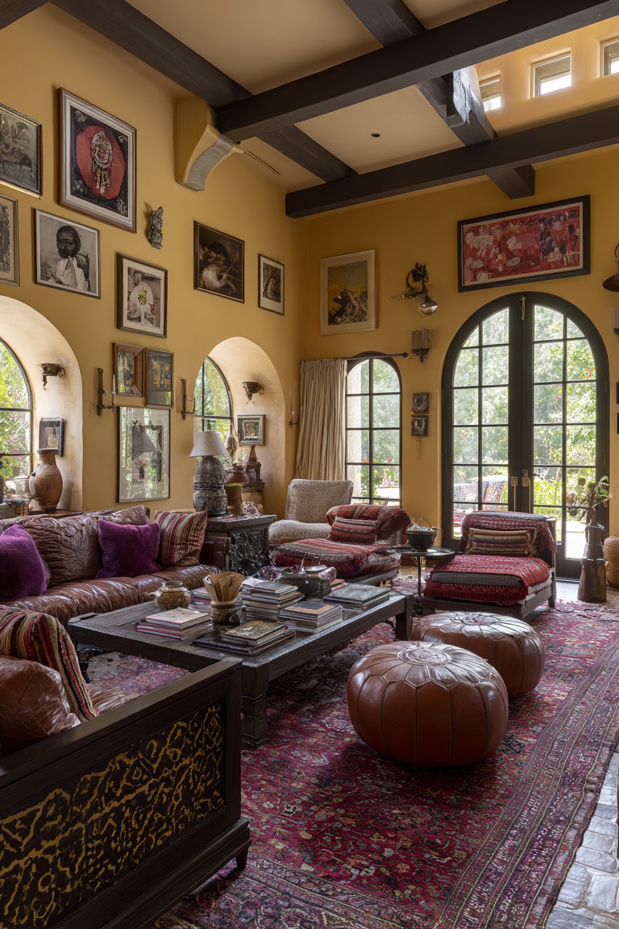
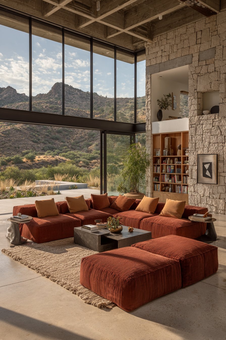
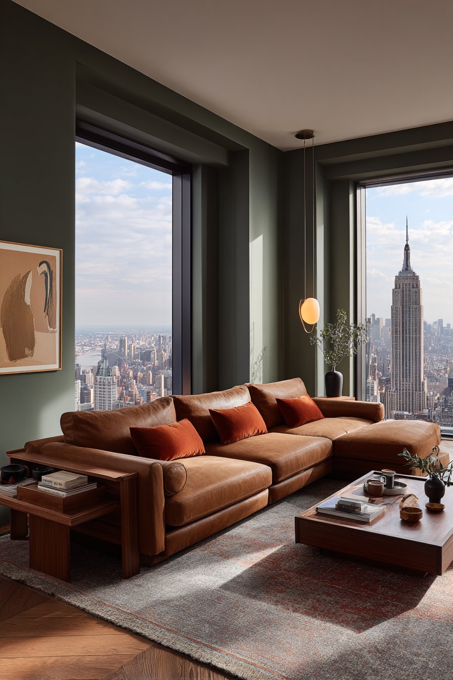
Warm colors like red, orange, and yellow evoke feelings of energy, passion, and excitement. These hues are associated with sunlight and fire, creating immediate psychological warmth in any space. Red increases heart rate and stimulates conversation, making it ideal for dining rooms and social areas. However, overuse can feel overwhelming and even trigger anxiety or restlessness in sensitive individuals.
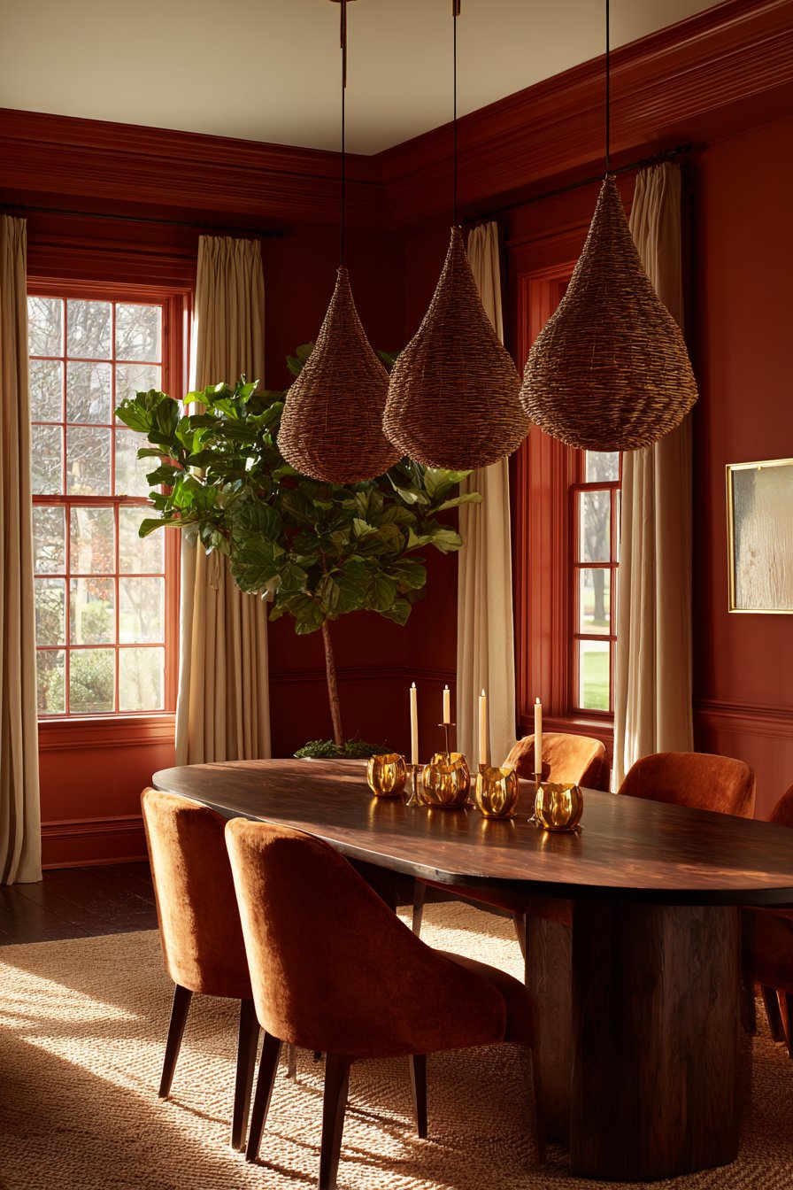
Orange brings enthusiasm without red’s intensity, promoting creativity and social interaction. It’s perfect for home offices or craft rooms where innovative thinking is valued. Yellow radiates happiness and optimism, lifting spirits in kitchens and breakfast nooks. The key is balancing these stimulating shades with neutral elements to prevent sensory overload.
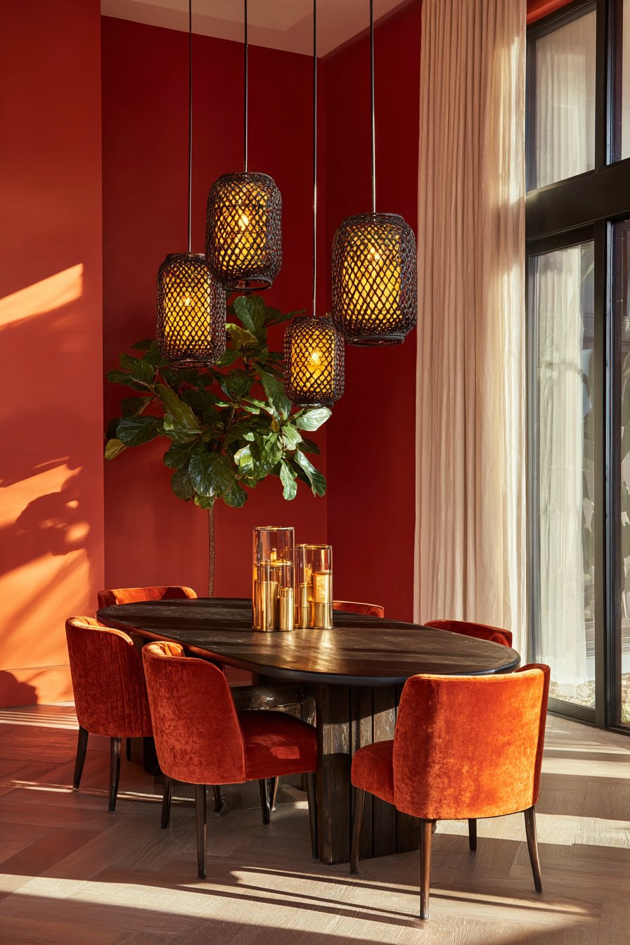
When incorporating warm colors, consider their psychological intensity and your room’s purpose. Use them as accent walls or in accessories rather than overwhelming entire spaces. These colors work best in areas where activity and engagement are desired, not in spaces meant for relaxation.
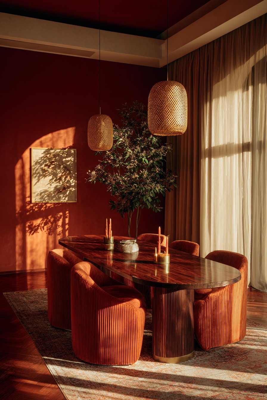
- Use warm reds in dining areas to stimulate appetite and conversation
- Incorporate soft oranges in creative workspaces for enhanced productivity
- Add yellow accents in north-facing rooms to compensate for limited natural light
- Balance warm tones with cool neutrals to prevent overstimulation
- Consider terracotta and burnt orange for grounded warmth without intensity
- Test paint samples in different lighting conditions before committing
2. Cool Colors for Calm and Tranquility
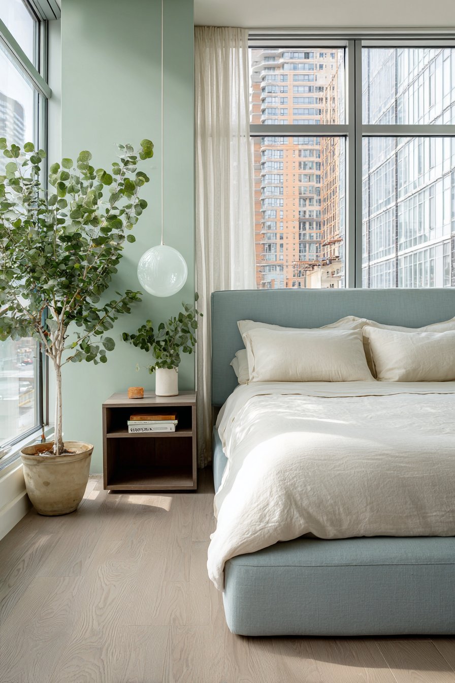
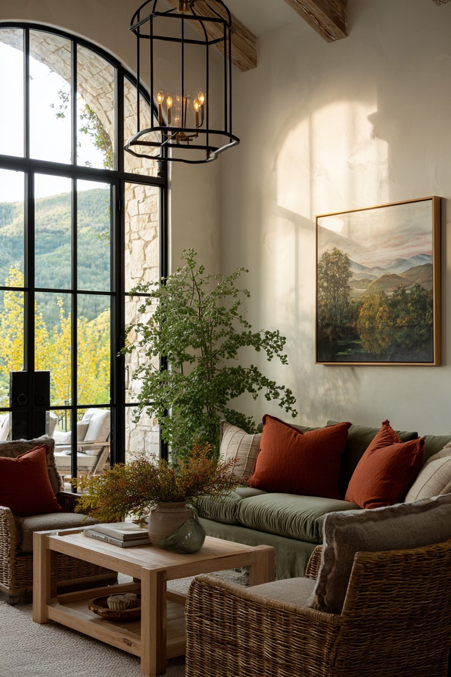
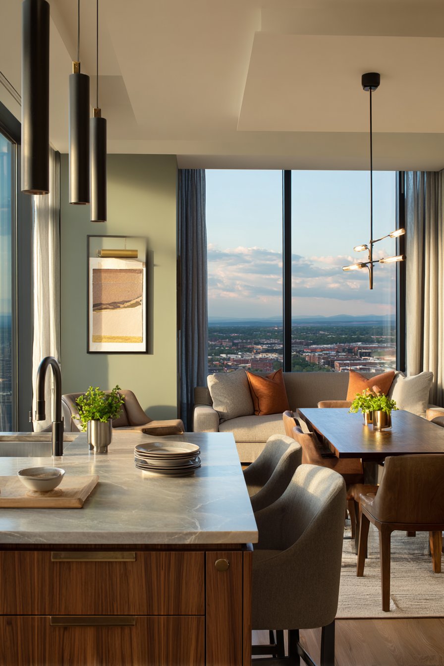
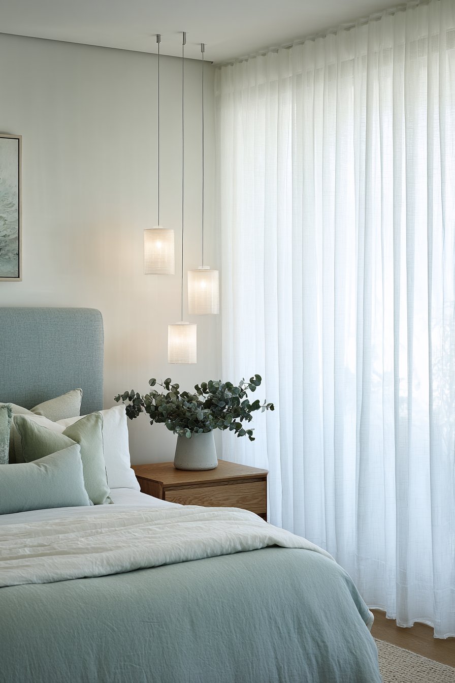
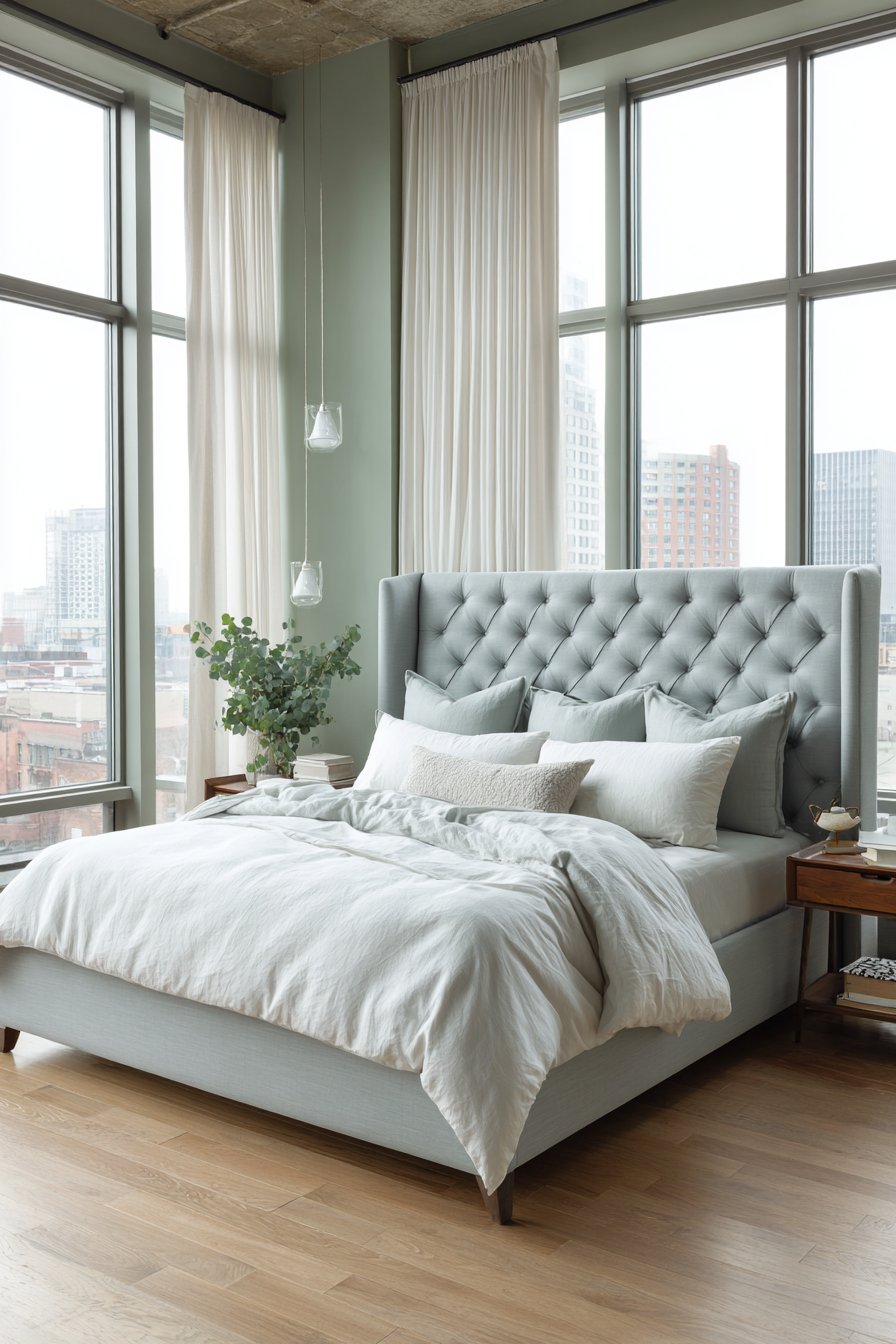
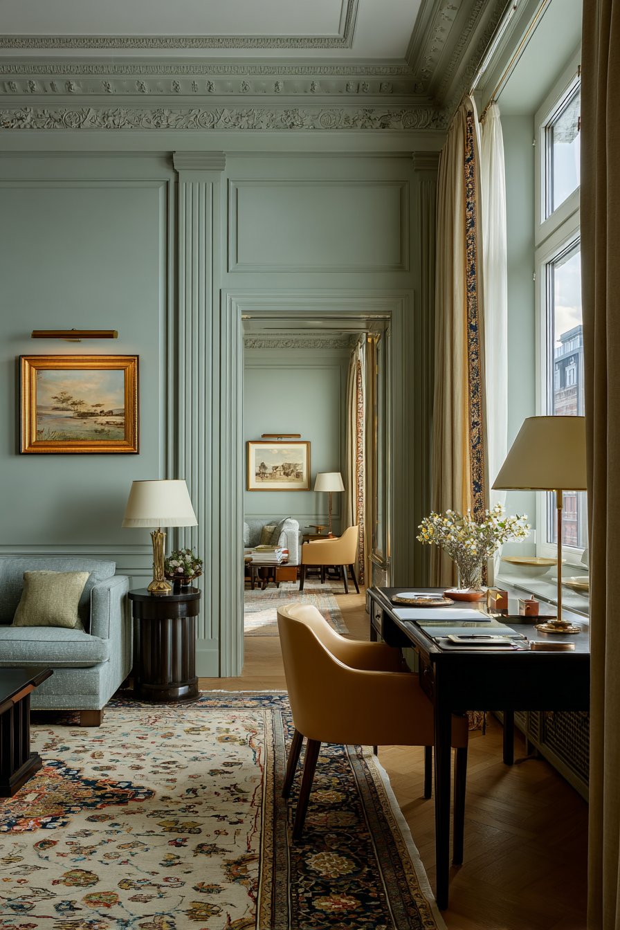
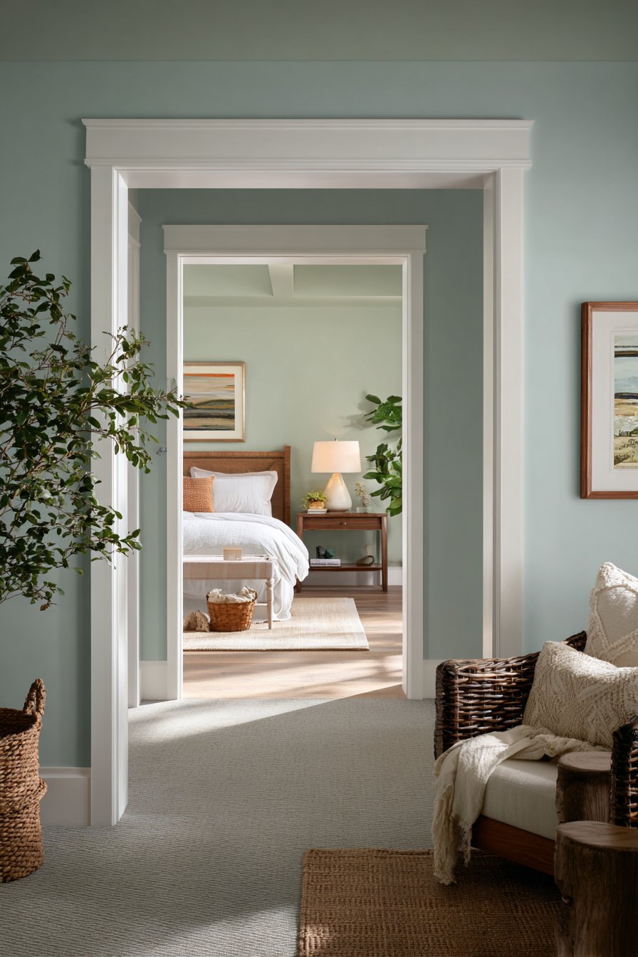
Blue, green, and purple fall into the cool color family, promoting calmness and serenity. Blue is scientifically proven to lower blood pressure and heart rate, making it the ultimate choice for bedrooms. It creates a sense of spaciousness and peace, ideal for small rooms that need to feel larger. Light blues evoke clear skies and gentle waters, naturally reducing stress levels.
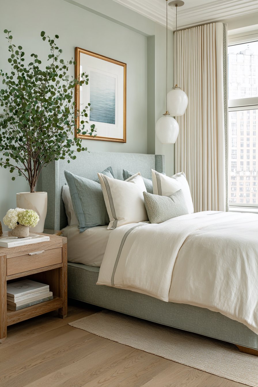
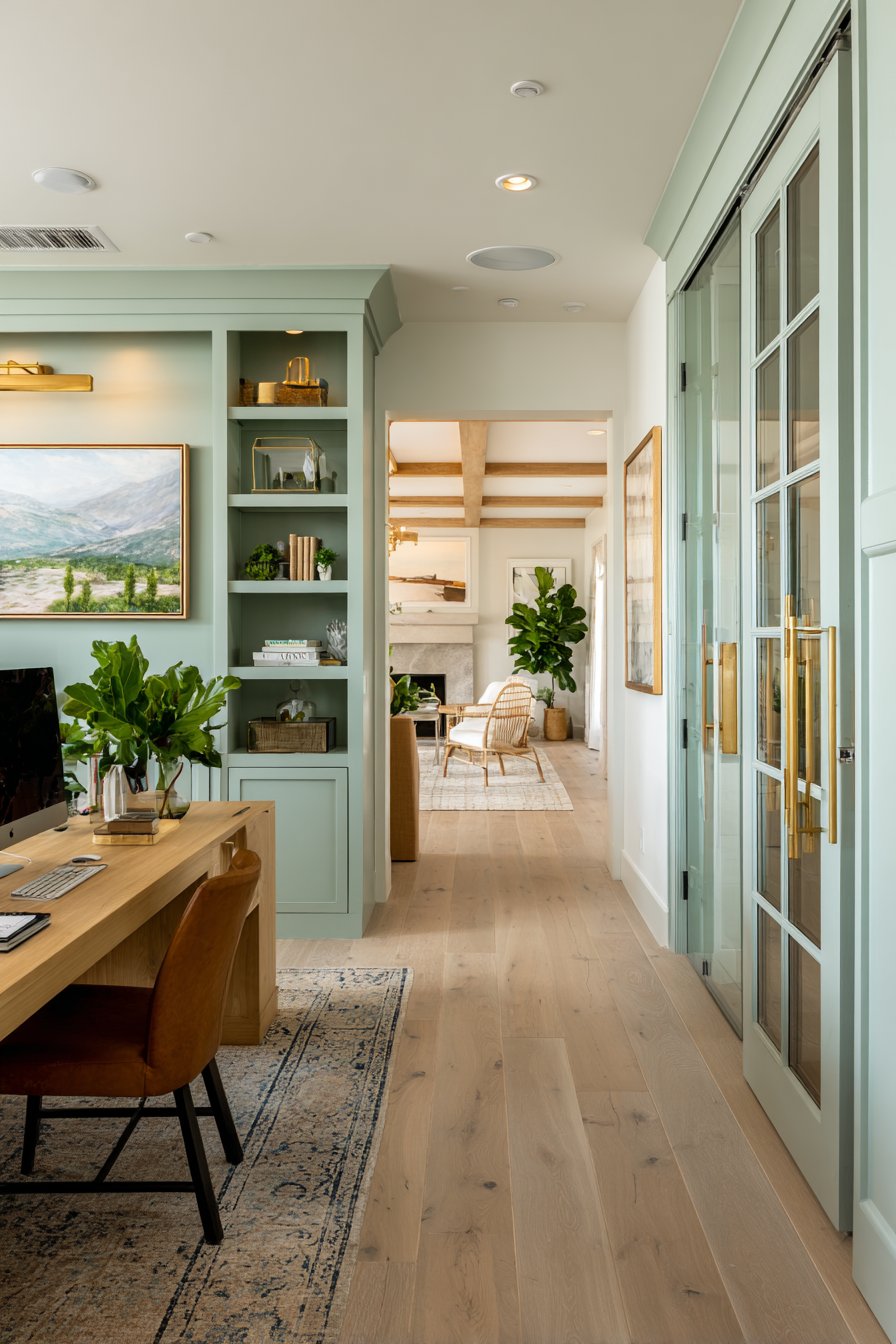
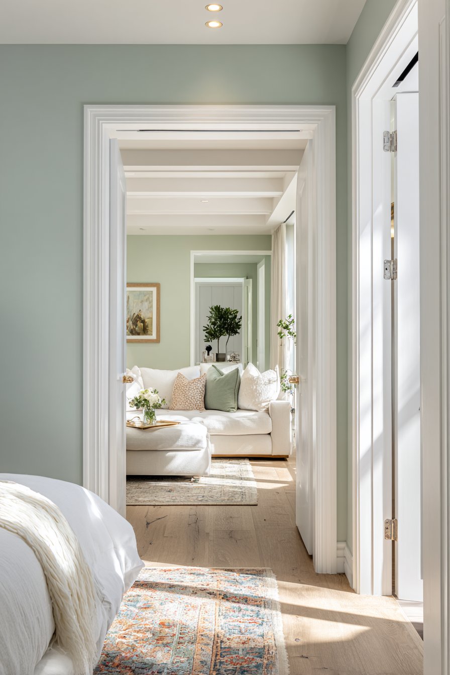
Green connects us to nature, offering psychological restoration and balance. It’s the easiest color for eyes to process, reducing strain during extended periods in a space. Green works beautifully in home offices, bathrooms, and living areas where you want to feel refreshed. Studies show it enhances concentration and creativity simultaneously, a rare dual benefit.
Purple combines red’s energy with blue’s calm, creating sophisticated ambiance with spiritual undertones. Lighter lavenders promote romantic tranquility, while deeper purples suggest luxury and wisdom. Cool colors are your allies in creating sanctuaries from daily stress, though too much can feel cold or unwelcoming without proper balance.
- Paint bedrooms in soft blue shades for improved sleep quality
- Use sage green in bathrooms for spa-like relaxation
- Add navy accents for grounding sophistication in living spaces
- Incorporate mint green in kitchens for fresh, clean energy
- Choose lavender for meditation rooms or reading nooks
- Combine cool colors with warm wood tones for balance
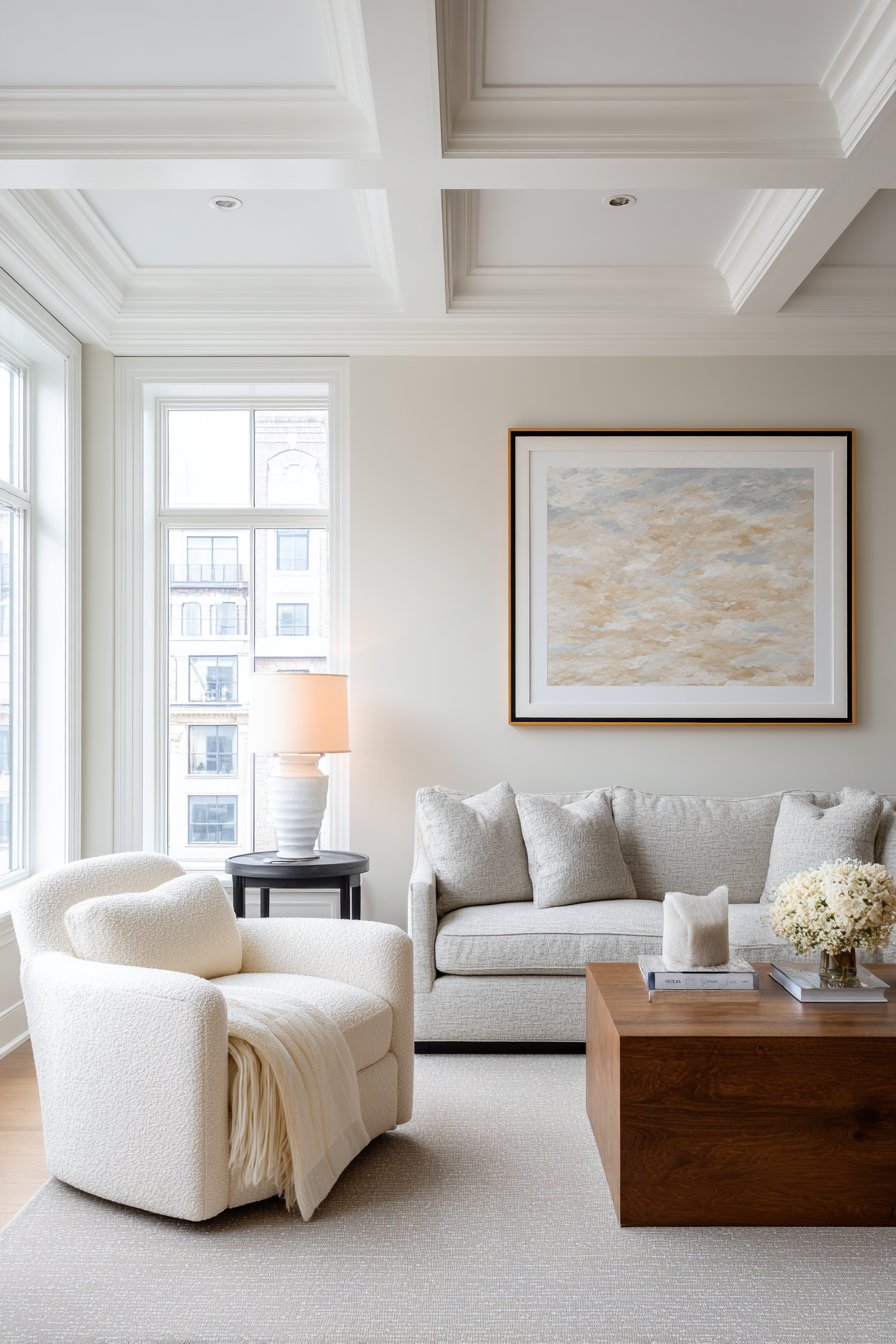
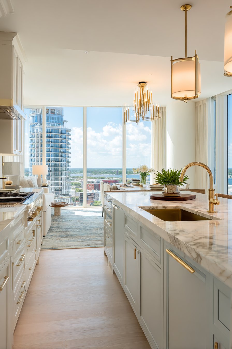
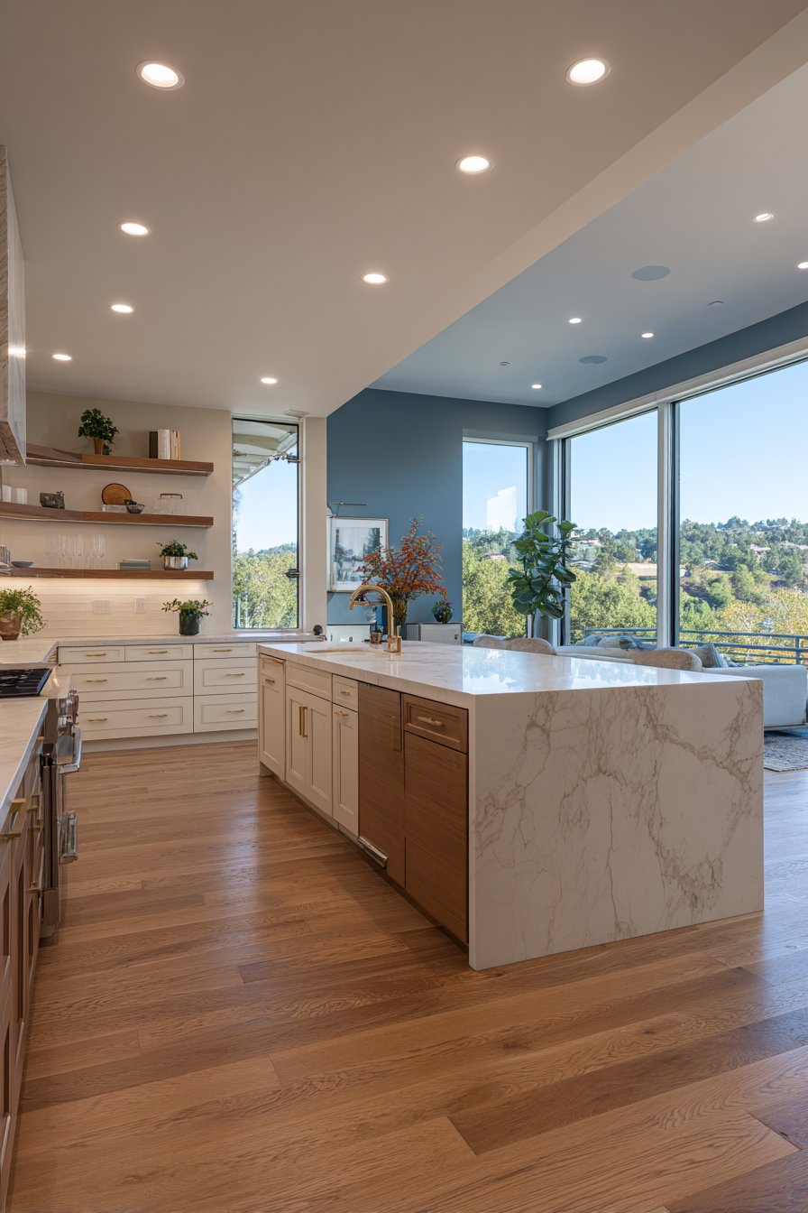
3. Neutral Colors as Foundation Elements
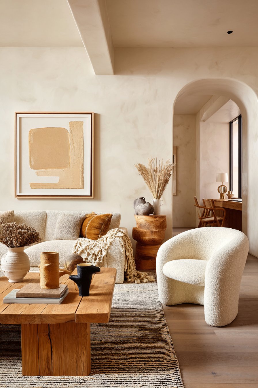
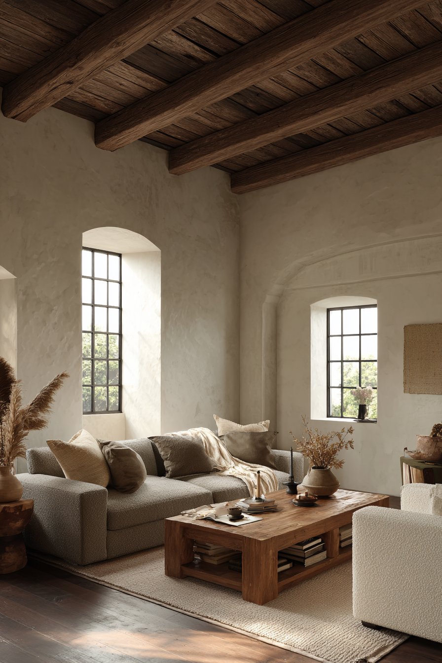
Neutrals including white, beige, gray, and taupe provide visual breathing room in home design. These colors don’t compete for attention, allowing your mind to rest and focus on what matters. White creates feelings of cleanliness and openness, expanding perceived space dramatically. However, stark white can feel clinical without layering warmer neutral tones throughout.
Gray has become incredibly popular for its versatile sophistication and modern appeal. Warm grays with brown undertones feel cozy, while cool grays with blue undertones feel crisp and contemporary. Beige and taupe offer timeless comfort, creating backgrounds that work with virtually any accent color. These shades make rooms feel larger while maintaining warmth.
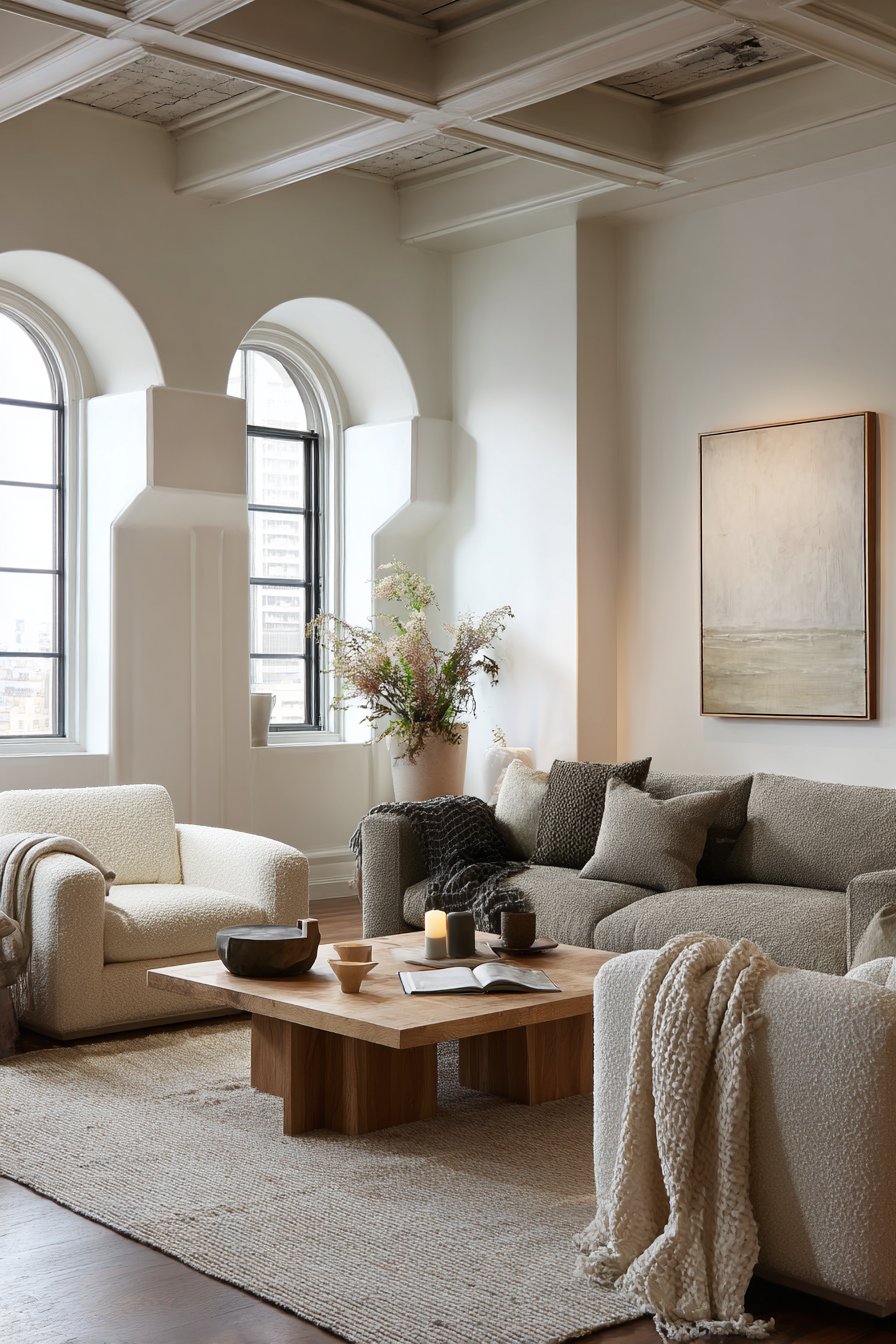
The psychological benefit of neutrals lies in their flexibility and calming neutrality. They reduce visual clutter and mental noise, particularly important in our overstimulated modern world. Neutrals serve as the canvas upon which you can layer personality through furniture, art, and accessories.
- Layer multiple neutral shades for depth and visual interest
- Use bright white trim to enhance architectural features
- Incorporate textured neutrals like linen and wool for warmth
- Choose greige (gray-beige blend) for ultimate versatility
- Add warmth with cream instead of stark white in cozy spaces
- Combine matte and glossy neutral finishes for sophisticated contrast
4. The Impact of Color Temperature
Color temperature refers to whether hues lean warm or cool, fundamentally affecting room ambiance. Warm colors advance visually, making spaces feel smaller and cozier. Cool colors recede, creating illusions of space and airiness. Understanding this principle helps you manipulate spatial perception through strategic color choices.
North-facing rooms receive cool, indirect light and benefit from warm color temperatures. South-facing rooms get abundant warm light and handle cool colors beautifully. East-facing rooms transition from cool morning light to warm afternoon tones, requiring flexible color schemes. West-facing rooms receive intense warm afternoon light, making cool colors particularly refreshing.
Temperature affects not just aesthetics but psychological comfort throughout the day. Warm-toned rooms feel inviting during evening hours but may feel heavy in bright daylight. Cool-toned rooms feel refreshing during hot afternoons but can seem cold and unwelcoming on gray winter days.
- Assess natural light direction before selecting color temperature
- Use warm neutrals in rooms with northern exposure
- Choose cool tones for south-facing spaces with abundant sunlight
- Paint samples on all walls to see temperature shifts throughout the day
- Balance room temperature with opposite-temperature accents
- Consider seasonal light changes in your region
5. Cultural and Personal Color Associations
Color psychology isn’t universal—cultural backgrounds create unique interpretations of specific hues. White symbolizes purity in Western cultures but represents mourning in some Eastern traditions. Red signifies luck and prosperity in Chinese culture but can indicate danger in Western contexts. Understanding these cultural nuances prevents unintended psychological responses in your home.
Personal experiences also shape color responses independent of general psychology. Someone with positive beach memories may find blue deeply comforting, while another person associates it with childhood sadness. Your individual color preferences should ultimately guide design decisions, as authentic expression creates the most psychologically beneficial spaces.
The most successful color schemes honor both psychological principles and personal resonance. Don’t force a color just because it’s trendy or supposedly calming if it doesn’t emotionally connect with you. Your home should reflect your personality while leveraging color psychology to enhance specific feelings in different rooms.
- Reflect on personal memories associated with different colors
- Consider cultural backgrounds of everyone living in the home
- Trust your instinctive responses to color samples
- Create color boards combining preferred hues before painting
- Respect that family members may have different color associations
- Allow personal preference to override general rules when necessary
6. Strategic Color Application Throughout Your Home
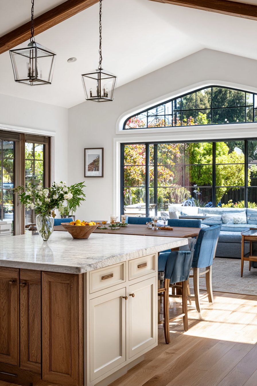
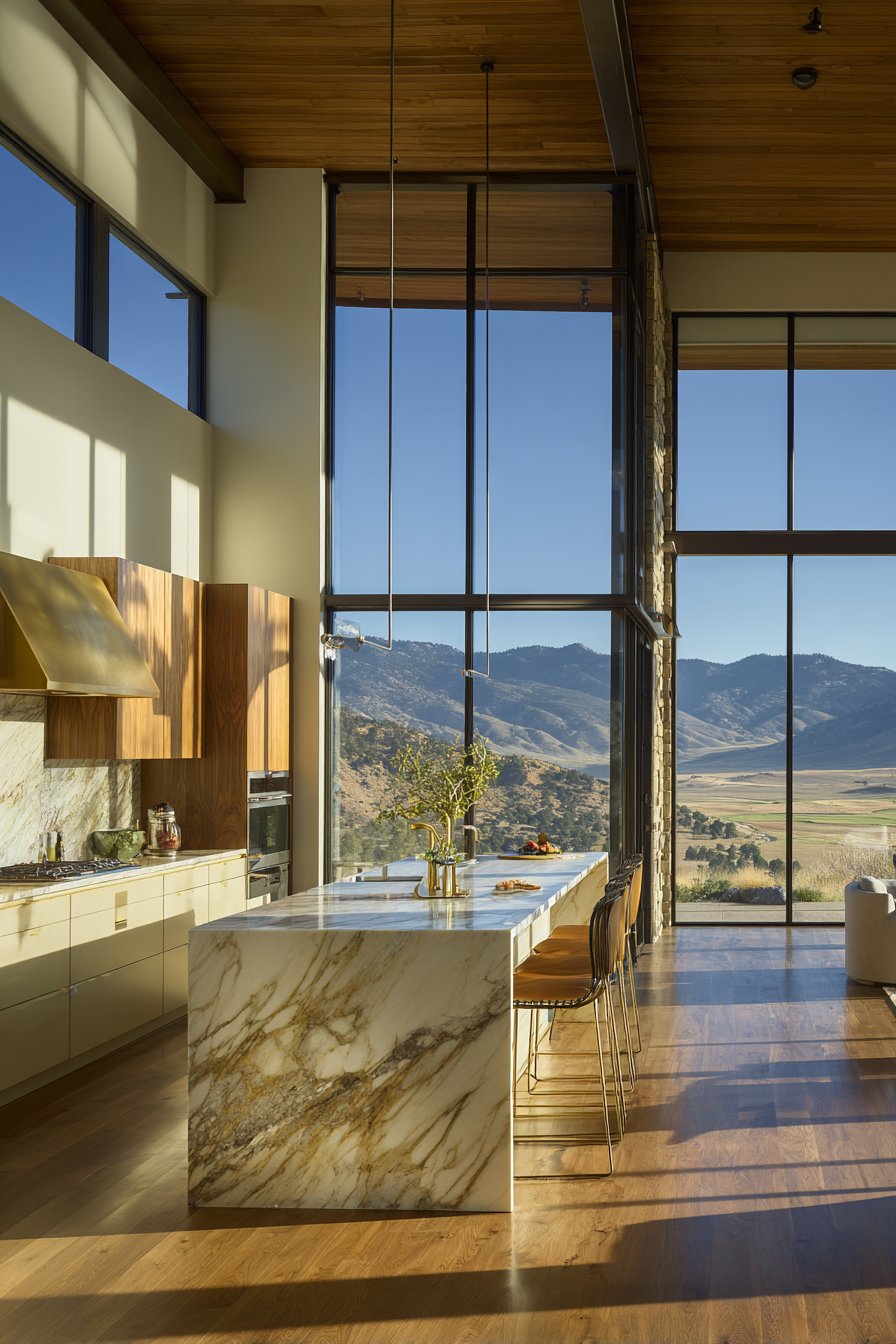
Implementing color psychology requires thoughtful planning for room-by-room purposes. Bedrooms demand calming blues, greens, or soft neutrals that promote restorative sleep. Home offices benefit from balanced greens or focused blues that enhance concentration without drowsiness. Living rooms should reflect your entertaining style—warm tones for social energy or cool tones for relaxed gatherings.
Kitchens traditionally use yellows and warm whites to create inviting atmospheres for family meals. Bathrooms feel spa-like with aquas, seafoam greens, or clean whites that suggest cleanliness and rejuvenation. Entryways make powerful first impressions with bold accent walls or sophisticated neutral foundations that welcome guests warmly.
Color transitions between rooms create psychological flow throughout your home. Abrupt color changes can feel jarring, while gradual shifts guide movement naturally. Consider your home’s overall color story, ensuring each room feels distinct yet harmoniously connected to adjacent spaces.
- Match bedroom colors to your sleep needs and preferences
- Use energizing colors in workout spaces or home gyms
- Create focal walls rather than painting entire rooms in bold colors
- Transition between rooms using related color families
- Consider ceiling colors for unexpected psychological impact
- Use color to define zones in open-concept floor plans
Conclusion
Color psychology offers powerful tools for creating homes that nurture emotional wellbeing and support your lifestyle. By understanding how different hues affect mood, energy, and perception, you can intentionally design spaces that enhance daily life. The colors surrounding you aren’t just decorative—they’re active participants in your psychological experience.
Start small by introducing color psychology principles in one room, observing how it affects your feelings and behaviors. Experiment with different shades, trust your instincts, and remember that successful design balances scientific principles with personal authenticity. Your home should be a reflection of who you are while creating the emotional atmosphere you desire. Let color become your partner in transforming your living spaces into true sanctuaries.